
A couple weeks back I was invited to speak at the Mobile Game Forum event. My topic?
A summary of some interesting game design trends for retention and monetization. My full slides are below, the ten I spoke about were:
1/ the rise of idle tap clicker games
2/ auto-play and where it goes
3/ games as spectator sport - esports
4/ adaptive pricing and balancing
5/ smarter live ops tied to monetization
6/ classic genres adapted smarter to mobile
7/ extending meta gameplay
8/ subscription and VIP programs
9/ faster player feedback and art a/b testing
10/ life beyond the RPG bloodbath
For any questions or feedback -
When it comes to free to play design, our starts with creative freedom and then decides through quantitative feedback.
In practice what does that mean?
Lots of experiments and A/B tests. Not just for features, UI and economy - but also game art. Here are some of the tactics we use:
App Icon
An app icon is always lowest hanging fruit when it comes to increasing downloads.
We use , built into the Google Play Developer Console for this purpose.
An example with one of our 3d simulation games:

Here we tested different icon compositions trying to “beat” the prior champion. One, two or no avatars? Elements from the theme, the gameplay, or just focus on characters?
After a couple of days of data we found a single avatar and gameplay background performed best, outperforming the original icon with a high degree of confidence (it’s handy to be able to see the expected performance interval directly in the results)

In one of our older dressup games we found an icon with a “popstar feel” improved install performance over 10% relative to the original - more than we would have guessed.
Apart from icons, we also use Google Play Store Listing Experiments to A/B test other aspects - screenshots, description etc. A handy tool!
Testing Game Art
We also test game art in two main phases of development:
Testing Concepts
Early in the design cycle our designers come up with art concepts and we get feedback on style / subject matter.
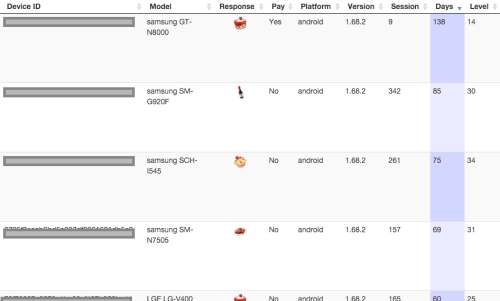
For example, in a farm prototype we wanted to add more crafting, and tested to see what players preferred to make. In this case there was a strong preference for cakes over other types of food and drinks:

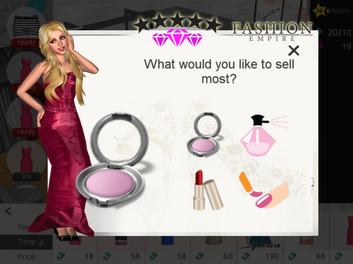
In another example we wanted to see what type of items players would want to sell next in a :
The feeling of spamming is always a concern with popups so typically we:
We use the and web dashboard for our in-game image and text surveys.
Sometimes we want to ask questions of people outside of our app’s current audience. For this we use , while more expensive, can be helpful especially when exploring a new audience type (you can setup qualifying questions, for example - do you play social casino games?)
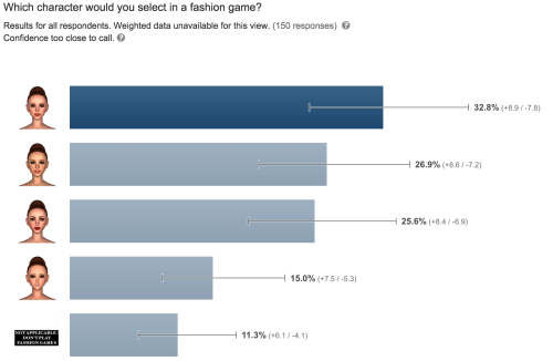
Apart from surveys we also use with hardcore fans for more traditional feedback and discussions:

Testing Produced Art
Once we have art created, we then poll the finished items. For example shoes in a fashion game:

Why? Mainly as input for balancing and content distribution.
For example an excellent first impression in NUX flow helps next day retention, so we plan for some of the highest rated items to appear up front.
We also want to make sure premium bundles and items have the most desirable content to improve conversion etc.
Source -
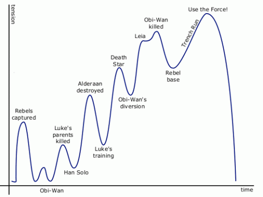
Just like the level of excitement tends to cycle up and down through a movie or game, I think a similar approach works when it comes to arranging content in a mobile 3d game.
A/B Testing Builds
Once everything is ready, we’ll often A/B test the new build itself using Google Play’s . Using this, we can decide how much of install traffic will be on a new version or the control (existing one).
If it’s a major art or feature change (for example a recent Christmas themed update during the holidays), we usually roll out 20% of our traffic and monitor over a week or more. This allows us to check at least the early retention and monetization metrics before we commit to roll it out 100%.
Conclusion
Being able to test art has had a number of benefits for our studio.
First it lets us try lots of ideas - mild and wild - at the concept phase, which is quite liberating from a creative standpoint.
Testing also lets us have confidence before we commit to production and launch, where the costs are vastly greater.
Most of all it this feedback loop helps us get closer to the most important stakeholder of all - our players!

ps - if you want to get in touch - my
How to kill the king?
It’s a question many midcore studios have struggled with.
For 3 years has stubbornly stuck to the top of the grossing charts, despite the efforts of many.

There have been the dozens of with the same basic formula - build a base, mine resources, produce armies and attack others while walling up and defending your own. There have been different themes and increasing production values, but so far no one has been able to knock Clash with its strong community, off its throne.
In fact the only pvp game to play at the top has been Game of War, which took a very different path by setting out to be the best hardcore strategy game, re-inventing a deep warfare formula that did so well for Kabam and others in prior years.
So is the only viable option in the genre to abandon casual accessibility and go hardcore?
Maybe not.
One new title, from Aegis Interactive, has gone the other way - stripping out complexity and going for mass accessibility.

As a game designer it’s a fun title to analyse.
The game eschews many “proven” mechanics and feels like a fresh take on a much-loved genre.
Let’s take a look at it’s more interesting elements:
Ditching army production
One thing a player in Gods will notice within the first few minutes is that there are no resources to mine and store, no factories to build nor build queues to produce armies.
In fact there are no armies to produce at all.
Instead, you have a small number of Gods to fight with and upgrade.

This has a number of advantages, especially for more casual players:
Ditching walls
When it comes to defense, in Gods as in other games you can build fixed structures like towers, and also fixed structures that permanently house defenses, for example archers.
They can be upgraded but don’t consume resources - they are always “full” for defenses and there is no production required - they act autonomously in your defense.
There are also no walls in Gods.
Whilst it’s fun to build up intricate defenses around storage units and towers, it’s also a big resource investment to commit to making (or upgrading a wall). Players have to spend days or weeks (or more) to finish one for a full base, during which time they feel weaknesses of their build. This of course helps a lot in monetization, but for those majority who never pay it can reduce the fun.

Instead of walls, Gods introduces houses which give proximity-based benefits to other structures, which gives fun strategy and decision making with a much lighter commitment than walls.
MOBA style attacks
With no offensive armies, attacks on other players feels more like a MOBA.
You attack with only a very small number of Gods, with full real-time control of movement, attack and special moves.
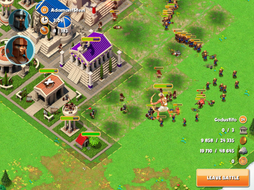
You win when you destroy all the enemy temples - your reward is the same regardless of what else is destroyed or left standing.
This has a number of benefits:
No backing out of attacks
One feature of traditional battle games is scoping enemies and deciding whether to attack or skip. This can often lead to large amount of time clouding to find an ideal target, during which time you are steadily consuming resources and getting bored. Instead, Gods lets you decide whether to face an easy, normal or hard opponent then then selects one you must attack - leaving the battle counts as a defeat.

With no armies or lasting hero health bars, there is no penalty to just giving it your best. Whist this approach can sometimes feel a unfair when you must fight overpowered enemies (matchmaking still feels rough), on the positive side it forces you to adapt to different situations and defence builds, rather than choose the ones you are more comfortable with.
This adds to the variety and the satisfaction of mastery.
Instant actions
Whereas other battle games tend to monetize in many ways including heavy use of slots and timers (see the approach to opening Gacha boxes), Gods appears to have made a conscious decision to go a different path.
It’s a happy surprise when building your first structure to have it complete instantly, with a resounding sound effect. The positive feedback loop is strong.
The single timer then that remains in the game is the slow stamina (nectar) recharge timer. ie- the freemium block:

Everything else is independent of time and by doing that the game feels “on your side”. One good example is clearing environment structures, which is not only instant but also consumes no resources or workers, and also grants resources as result.
This approach seems to be helping - with positive reviews and high ratings, despite the main recharge timer being currently very strict - allowing 4 battles every 4 hours only (each lasting a minute or two).
Real-time guild co-op
With such a strict stamina charger, there is a lot of spare time between attacks on other bases. In Gods this is put to excellent use through a well designed live alliance system.
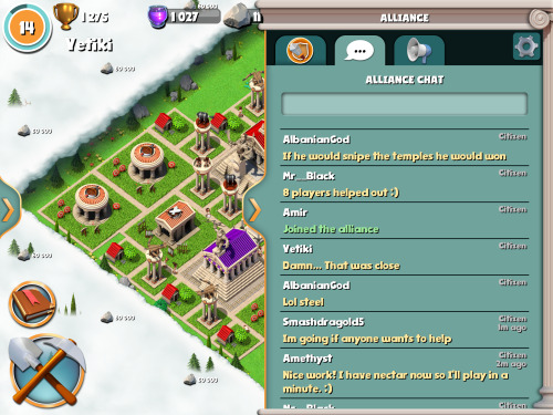
Unlike other games, right from level 1 you can instantly join an alliance and once in, you will see in real-time attacks by and on your alliance members, and even better - jump in and help:

In just seconds you are in the middle of the conflict, and can support by placing down supporting troops with cooldown - fixed troops that appear of equal strength, I think regardless of level (not sure about this).
There is no costs to the troops - they do not come out of your army or resources, they just appear and help in the defense or offense.
More than one alliance member can come to the aid in a single battle:
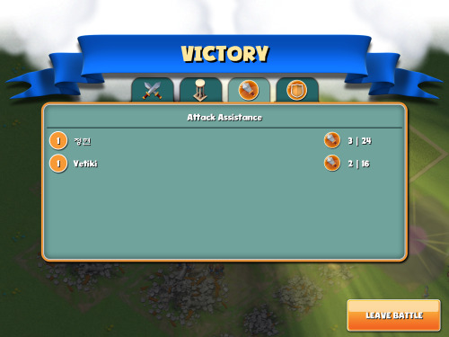
This system works very well in practice:
No loss from being attacked and defeated
When others attack your base and prevail, you don’t lose anything apart from some minor ranking impact. In fact if you defeated any of their heroes in your loss, you still get a minor bonus granted.
Whilst this reduces the intense revenge feeling when someone attacks in other games, in Gods this means you avoid the feeling of wanting to give up totally on coming back to a wrecked base, or feel it’s not fair when paying users take your effort away from you.
This adds up to the positive impression of the game and community.
Test attacking your own and alliance bases
Another smart feature is that Gods lets you, for much lower stamina cost and no rewards, attack your own base and test your own builds out.
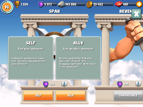
You can also do the same with alliance mates (spar) which can give a lot of entertainment and relationship building while waiting.
This provides fun additional gameplay without affecting the balancing.
Free story mode
Continuing the theme of feeling friendly, there is a free story mode that consumes no resources, and gives progressively more difficult attack and defend scenarios. If you lose, you can instantly try again.

It’s another way to ease more casual players into the gameplay and the world of tactics - you get to play with heroes apart from your own as well.
Summary
Gods of Olympus is a well designed game that has taken an interesting approach.
It has chosen to strip out many extras and focus on its core - fun and accessible real-time battles with alliance friends.
Whilst the lack of mechanics such as timers and armies might cause a lower payer LTV compared to games like Clash, I believe it gives itself a better chance to attract and retain players. This in turn would make a strong foundation to then introduce elder gameplay to its community over time.
So will it really challenge Clash? It’s too early to tell - but it’s a fresh take and I think has real potential. Now, back to playing!
ps - I don’t have any connection with Aegis, this is just my take as a game designer and player. If you want to get in touch - my
[video]

It’s been a crazy year!
Lots of projects. Late nights.
A windy path from ideas to reality…
Here’s 10 game design lessons learned this year:
1/ If in doubt, take it out.
A few months ago we had a game prototype with some half-finished features. One was a Gallery to help players savour past adventures. When push came to shove we removed it from the alpha - after much hand wringing and a tinge of guilt.
So what was the impact of the removal? Not much.
The fun factor remained almost identical without it.
We freed up cycles to improve the core gameplay, with a much better game as a result (one that still doesn’t include the Gallery… but we’re fine with that)
Early on, less is more.
2/ Context, child.
In that same project we had an item discovery mechanic we named the “Shop”. In focus group after focus group players told us they felt frustrated and confused.
At one point I questioned whether the mechanic would work, and considered a switch back to something less risky.
In the end, the fix was simple: don’t call it a “Shop” (doh!)
Once we switched the name, expectations changed and a under-performing feature turned into something fun.
3/ UI = "Ultra Important"

One stuff up this year was an RPG, an early project we had to reboot.
The mistake?
Designing a deep game that seemed fun in a GDD, but couldn’t work in an actual phone UI.
I had designed the specs on paper, our devs implemented much of the systems before reality dawned - we couldn’t fit it all on the screen without greatly confusing players.
And by that time mechanics were too heavily linked, making it much harder to remove individual parts.
Ever since, we’ve had UI mockups in lockstep with game designs and prototypes. More up front work but far less pain down the line…
4/ Don’t balance bottom up
It’s not much fun to build a fun prototype and see players blow through the content too quickly. Or discover there aren’t enough quests to fill out mid-level progression.
The big picture lets you set your anchors in days, weeks, months and years, and guides you on how much to fill in the day-to-day path.
5/ Dialogs deserve prototypes too!
Raise your hand if you had to rewrite or throw file away thousands of lines of text. Perhaps twice?
*sheepishly raises hand*
Why?
We started text “production” before we’d set the right story form and function to fit the game and UI. And in another case because the mechanics changed and made the original text redundant.
It’s much better to test a small amount of text first and then write the rest once later on, once it’s all locked in.
6/ Don’t bumble the bundle
In a recent beta we had to delay to optimize the initial download to under 50MB. This required dropping assets to later bundles and adjusting tutorial, thankfully not too bad as we have a streaming asset system, but still a last minute scramble.
And no, you can’t really “cheat” and just put overflow into an initial download on first run. We’ve seen 40%+ dropoff rates with even as small as a 30MB download after first launch.
Thinking through the initial asset budget in more detail saves headaches down the line.
7/ Plant your story in a big pot

We discovered that our first game continues to have a much longer lifespan than expected, with many players playing now for over a year.
At the time of launch, we hadn’t thought through the story expansion, and had to twist together a second act that resulted in some inconsistencies we had to iron out later (the game now is more than double the original in length)
These days we imagine a launch version is just the first part of at least a trilogy worth of content that we have thought through (at least at a high level), to make sure we have plenty of space for expansion.
8/ Programmatic trumps manual balancing
Well strictly speaking, that’s not always true.
There are always some parameters better hand crafted, particularly in the NUX.
But as a game designer you only have so much time in the day, and you can’t spend them hand crafting prices for thousands of items, or manually pick rewards for hundreds of levels.
We switched the bulk of balancing for new projects to formula bases.
A bit of extra work up front for the coders now results in many benefits:
- much faster tweaking of difficulty and progression
- lets us goal seek the parameters to meet overall balancing goals
- enables us to run much easier A/B experiments
- more sleep
9/ Polish can wait.
Similar to premature production of text, creating near polished UIs and icons for a system that ultimately had to be changed…
I find now it’s much better to stick generic all the way through the prototyping and alpha, and then start real art production and polish at the last step.
This has had an extra benefit of helping concentrate on core gameplay early on, rather than what shade of purple to use for that Settings icon.
If a temporary “wireframe” UI can house a fun game, it’s a great sign for later when the real art and polish is added.
10/ New location for new inspiration

It’s funny how a change of environment, even for a few hours can spur new thinking.
Exotic subreddits, watching TED talks or reading books are fine, but there’s something fresh about time away from the office.
One of our new game designs was conceived during a weekend startup hackathon, in a big theatre amongst lots of great startup energy.
Another idea I’m in love with came from chatting to some young hippies in San Francisco (yes, the world deserves a basket-weaving game!***)
Summary
Like most endeavours in life, learning to make great games is a journey, and the wins but also missteps have lots to teach.
Thank you 2013, you’ve been great.
What lessons do you have? or , would love to hear.
*** well not that idea, though it could be pretty fun….
Let’s imagine games as people.
We’d think of attributes - brash or quiet, strict or forgiving, quirky or dry, daring or safe etc…

As game designers - what traits do we want for our game?
Well, people tend to gravitate towards and , and . Makes sense, and there are plenty more on the list (1)
How about empathy?
In relationships, people (2) tend to value those who are thoughtful and make an effort to consider their point of view.
Let’s call it a game that’s “on your side”.
It could be reflected in the core design and UI, and also in various small and simple features that signal the game’s looking out for them.
Some nice examples -
In by Machine Zone, the free speedup option let’s players shortcut timers when they fall under a 5 minute threshold:

In by IGG, when you first run out of coins you’re given extra for free to keep playing:

In Zynga’s , hero quests don’t consume the items they request, allowing you to sell them after:

The birthday gift in Supercell’s feels thoughtful and personal -
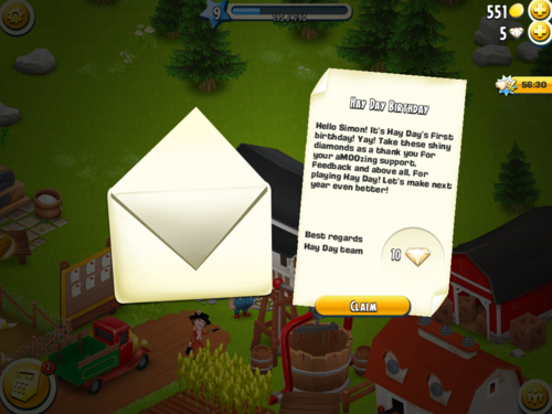
So are these games at their heart, altruistic?
Not at all (3). Let’s not forget they are still free to play games that do a great job of extracting revenue from paying users, as they should.
But they do a good job of signalling they care for the players, and in the process help build attraction and loyalty.
Notes
(1) beyond the universal ones, player taste and personality matters a lot
(2) this particularly applies to
(3) as any free player struggling with storage limits and ingredient production times in Castleville’s mid game would tell you
Other great examples? I’d love to hear - or .
It was fun to talk about live operations, specifically time limited* content and mechanics, at this year’s .
I’ve uploaded my slides here, which cover:
* new levels and missions etc also falls under the topic of live ops but the slides focussed in on time limited content.
The talk itself was only 20 minutes which was a shame as it’s a fascinating topic and lots of interesting things to go into (eg- pros and cons of different contest mechanics etc)
Any great examples of live ops out there? Share on or
New iOS, new App Store…
If you’re like me, it’s time for optimism with a touch of dread. Are the changes better or worse for my apps? My players?
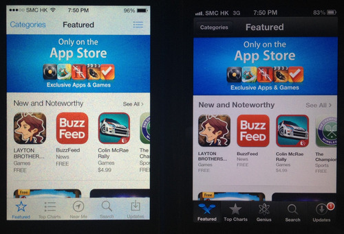
Recently checked out the Appstore in iOS 7 vs iOS 6. Overall it’s a step forward and imho mostly positive for devs. Here are the side-by-side iPhone screenshots. Recommendations at the end.
Featured Page
Top Charts

Category navigation

Subcategories - eg Role Playing

Near Me vs Genius

Search

Screenshots

App Main Page

Reviews Page

Related Page

My take
ps- big thanks to ‘er Jer for pulling this together!
Your thoughts? Have I missed something? Share on or

E3 was manic.
A whirlwind of next gen consoles and triple A titles.
This year I roamed the show floor trying out as many games as possible.
Most were bigger & badder takes on familiar genres.
on Xbox One was stunning. ’s animations flowed better than ever. had gunplay, underwater! Ubisoft’s pulled us into an immersive wired city. Oh and mechs are !
So what about non core games?
Not that many.
With a of most of the industry remains focussed on its male core gamer demographic.
There were bright spots though - 5 personal highlights:
1/ That Dragon, Cancer
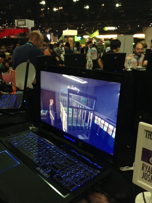
Not so much a game as a thoughtful piece of art. The setting is a sad hospital room, the character a cancer patient and his thoughts. This had the most emotional impact, despite the lack of fancy graphics.
2/ Project Spark
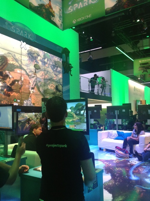
Little Big Planet and Minecraft just had a love child…
This was the most awe inspiring demo at the event. Microsoft’s ambitious game creation is a joy to play with: the first time you swipe your finger and literally create worlds of ice and forests before your eyes takes your breath away.
3/ Octodad
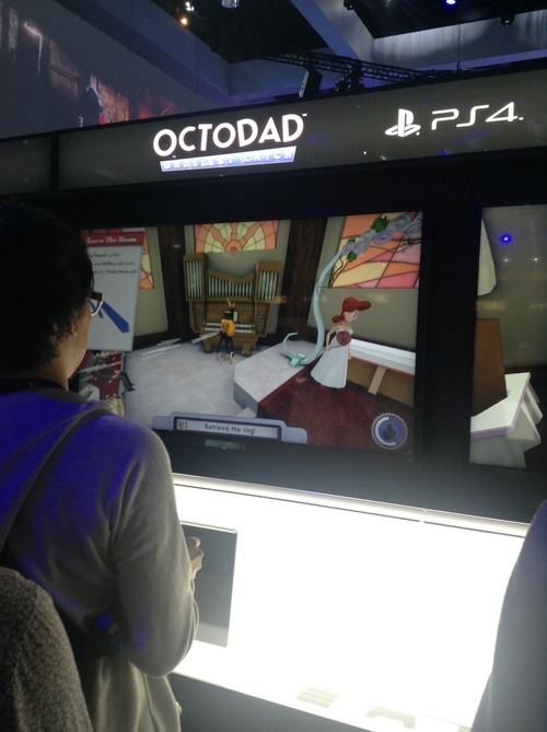
Octodad is so ridiculous in its premise it can’t help but bring out the smiles. Trying to control Octodad’s clumsy tentatcle to retrieve a wedding ring for your (female) bride is a farce, in a good way. The game bursts with personality and character, a welcome contrast to all the high speed action and violence in the rest of the PS4 zone.
4/ Contrast
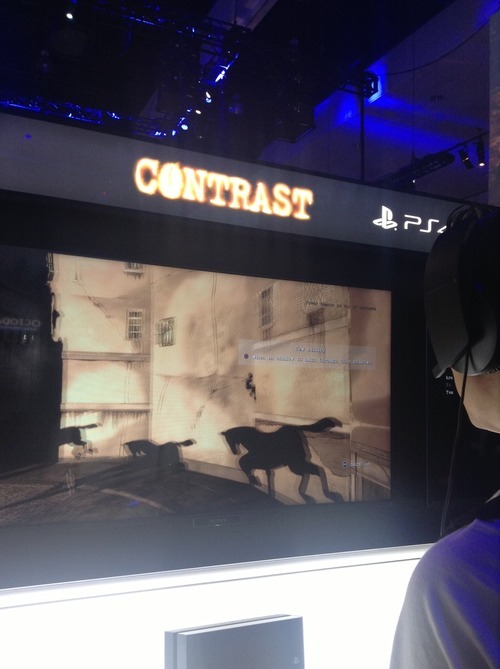
This action leaves a dark impression. Contrast has intriguing female leads, gorgeous french noir art and a gameplay twist. When your character’s shadow is on a surface you can change modes and control your shadow in 2d, moving and jumping amongst other shadows. Whilst frustrating in its controls it pushes the boundaries in creative gameplay.
5/ My School
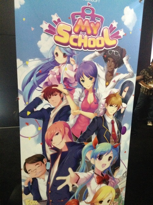
Not sure whether I’d call this a highlight or not, but worth a mention. This over the top school simulation game features plenty of “only in Asia” quirkiness (maybe fitting from a studio called Racoonsoft). Busty teachers, an overabundance of cola machines and confused students looking for work, this game had it. When I asked the goal of the game, I was told it was “to make money”.
Education these days :)
ps - special mention to - who knew 101 character multiplayer chaos could be so much fun…
What were your E3 highlights? or let me know on

New bootstrapped startup?
Building a new app?
Ready your credit card.
Back of the envelope costs
Based on
Conclusions
Footnote
Question - is there a cheaper way?
What’s your take? or let me know on