When it comes to free to play design, our starts with creative freedom and then decides through quantitative feedback.
In practice what does that mean?
Lots of experiments and A/B tests. Not just for features, UI and economy - but also game art. Here are some of the tactics we use:
App Icon
An app icon is always lowest hanging fruit when it comes to increasing downloads.
We use , built into the Google Play Developer Console for this purpose.
An example with one of our 3d simulation games:

Here we tested different icon compositions trying to “beat” the prior champion. One, two or no avatars? Elements from the theme, the gameplay, or just focus on characters?
After a couple of days of data we found a single avatar and gameplay background performed best, outperforming the original icon with a high degree of confidence (it’s handy to be able to see the expected performance interval directly in the results)

In one of our older dressup games we found an icon with a “popstar feel” improved install performance over 10% relative to the original - more than we would have guessed.
Apart from icons, we also use Google Play Store Listing Experiments to A/B test other aspects - screenshots, description etc. A handy tool!
Testing Game Art
We also test game art in two main phases of development:
Testing Concepts
Early in the design cycle our designers come up with art concepts and we get feedback on style / subject matter.
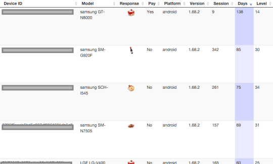
For example, in a farm prototype we wanted to add more crafting, and tested to see what players preferred to make. In this case there was a strong preference for cakes over other types of food and drinks:

In another example we wanted to see what type of items players would want to sell next in a :
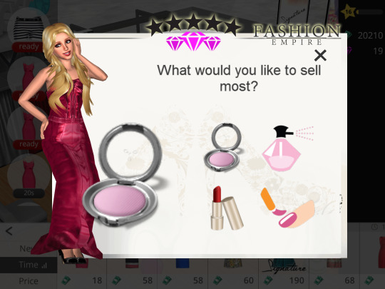
The feeling of spamming is always a concern with popups so typically we:
We use the and web dashboard for our in-game image and text surveys.
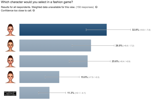
Sometimes we want to ask questions of people outside of our app’s current audience. For this we use , while more expensive, can be helpful especially when exploring a new audience type (you can setup qualifying questions, for example - do you play social casino games?)
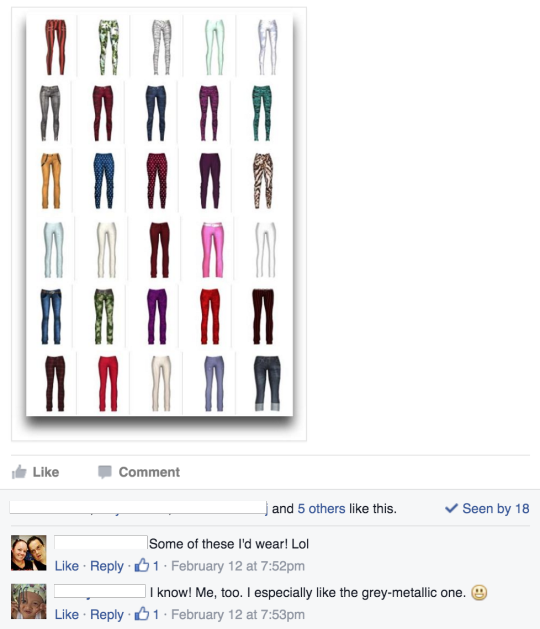
Apart from surveys we also use with hardcore fans for more traditional feedback and discussions:
Testing Produced Art
Once we have art created, we then poll the finished items. For example shoes in a fashion game:

Why? Mainly as input for balancing and content distribution.
For example an excellent first impression in NUX flow helps next day retention, so we plan for some of the highest rated items to appear up front.
We also want to make sure premium bundles and items have the most desirable content to improve conversion etc.
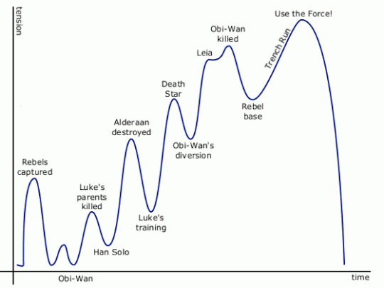
Source -
Just like the level of excitement tends to cycle up and down through a movie or game, I think a similar approach works when it comes to arranging content in a mobile 3d game.
A/B Testing Builds
Once everything is ready, we’ll often A/B test the new build itself using Google Play’s . Using this, we can decide how much of install traffic will be on a new version or the control (existing one).
If it’s a major art or feature change (for example a recent Christmas themed update during the holidays), we usually roll out 20% of our traffic and monitor over a week or more. This allows us to check at least the early retention and monetization metrics before we commit to roll it out 100%.
Conclusion
Being able to test art has had a number of benefits for our studio.
First it lets us try lots of ideas - mild and wild - at the concept phase, which is quite liberating from a creative standpoint.
Testing also lets us have confidence before we commit to production and launch, where the costs are vastly greater.
Most of all it this feedback loop helps us get closer to the most important stakeholder of all - our players!

ps - if you want to get in touch - my