5 reasons virtual worlds died

Edit: HN discussion on this post
Lately I’ve been designing a couple new games and got me thinking back to virtual worlds.
Remember when they were the next big thing?
Millions of us tried them. Gartner 80% of all net users would have Second Life avatars. VCs invested . Even Google a piece.
My startup too. launched the first browser 3d UGC world with cool tech we built on Unity. You could chat, create, shop and more.
But after a couple years we’d only gained 600k users so decided to pivot to mobile .
Here are 5 reasons why virtual worlds never took off and some ideas for how they can live on in new games:
- No purpose
Virtual worlds don’t have explicit goals.
No quests. No mechanics. No problems to solve. They aren’t games.
Give people a blank piece of paper and ask them to “have fun!” A few might get excited and start writing a poem or sketch a masterpiece. But most will be annoyed, grow bored and give up.
Same with virtual worlds.
-
No feedback
Turns out, humans really love feedback.
Our addictive behaviours are mostly shaped by tight stimuli and response schedules. We check Facebook often with the hope of new message or notifications. We eat junk food and are rewarded with an immediate dopamine hit.
Contrast that to virtual worlds where you might “work” for hours before getting feedback, which can only come from other players. Not very motivating.
- No theme
Most successful UGC communities have either a particular topic that glues them together, or easy ways to dive to them.
Reddit has subreddits. Pinterest has tags and categories. Youtube has search and recommendations.
Themes make it easy to consume, start and keep up conversations.
In virtual worlds there is no easy way to jump straight into the themes you like, and no structure that enforce adherence to them.
- Complexity
Great technology doesn’t mean a great user experience.
Virtual worlds offer great freedom, but also a LOT of complexity and ways to get stuck.
These days where the distractions abound, people don’t handle complexity well, especially when trying something for the first time.
-
Needs met elsewhere
Despite drawbacks, virtual worlds offered a couple of bright spots - online community and freedom to create.
But the spirit of these can also be met in other ways.
I can build a great farm in Hay Day or doodle in Draw Something 2, interacting with friends in simple but meaningful ways.
Minecraft offers great creativity and community with a small number of important mechanics.
On the deeper end, MMOs like Entropia have great freedom and incredibly loyal community.
So what’s new?
So for those of us creating mobile games, should we forget about virtual worlds?
I don’t think so. Whilst never living up to its hype*, we can continue to incorporate their positives in a deeper way.
First is to figure out how to tie greater creativity into our mechanics to broaden .
This can be really tricky - how do you “judge” creativity in a programmatic manner? Easier if it’s creativity to meet a certain functional goal (ala Bad Piggies), but is there a way to judge “beauty” or “artistic merit”? In our first game we built a system to judge a fashion outfit. Whilst sufficient I’d be first to admit there is a lot more nuance that could be added, though it’s not always easy to define and balance such a system.
If judging is community based how to you build systems to make it fair, tamper proof and not feel like work? And do it in a way that’s timely, and gets the core loop running quickly?
We could also do more to foster friendships between players that last years, not days. Ability to collaboratively work on shared projects is something extremely meaningful in virtual worlds. Guilds in some mobile strategy games let you coordinate attacks which is lots of fun, but haven’t seen much yet in the way of coop base building, or crafting etc.
We can offer a deeper level of customization, allowing you to tweak not only your look but your personality and how you engage in the game world. Chat and status messages are a start, but could you have ways to customise how your characters or army or base react programmatically under different circumstances (like scripting in SL but without the complexity).
Not all virtual world concepts translate well, and getting them working with a simple UX for a small screen is the challenge, but there are things we can learn from and adapt.
What’s your take? or let me know on
*Whilst not a mainstream success, virtual worlds are still active amongst several niche groups, eg deep roleplayers, virtual artists, or the disabled - where they can move, express and socialize in a way they can’t in real life.
Rise of the microsale

There’s an interesting trend bubbling up of extremely time limited offers in mobile games - let’s call them microsales.
In a microsale, there’s an offer - for example a deal on a virtual item, currency or content (eg- access to a special dungeon). This is presented with a very short countdown timer, typically 20 seconds or less.
The player is forced to make an explicit decision on the spot - take the offer now or let it pass with regret and uncertainty as to when or if it would return.
It’s an interesting entry in the monetization toolbox, and one that to me, makes sense:
A by Scott Swain, Richard Hanna and Lisa Abendroth (2006) examined 3 mechanisms (deal evaluations, anticipated regret, and urgency) that influence purchase intent, through the lens of time limited sales. They concluded:
…shorter time limits create a greater sense of urgency thereby leading to higher purchase intentions…giving consumers more time leads only to more delay and, in effect, the shorter time limit causes the promotion to gain priority on consumers’ “to do” lists. However, caution is needed since… too short of a time limit can also increase perceptions of inconvenience, leading to lower deal evaluations and ultimately lower purchase intent.
On mobile the “inconvenience” factor I think is reduced - you’re already in a “limited time” frame of mind, and all it takes is a single tap on a button to take up the offer - especially when using virtual currency, not needing the interruption of IAP password entry.
That out of the way, all you need is a sufficient time for the deal to be evaluated, which is normally in the period of seconds, not minutes.
Does that mean traditional 24 and 48 hour digital sales are on their way out? I doubt it, but I suspect that we’ll see a lot more of microsales used in parallel in the future.
Have you used or seen a microsale lately? Would love your feedback. or
Whither the wither mechanic?

In the first social game wave, two common mechanics were harvest (appointment) and its companion, wither (delay penalty).
Playing off the harvest, the wither helped reinforce the regular return cycles those games were designed around. How?
The fear of loss can be strong. The feeling that your precious crops would decay (or be ) was a strong motivation to log on that one last time before sleep or early morning before packing lunch for the kids.
Fast forward two years later, the wither mechanic seems to be falling out of favor.
This year’s most successful mobile farming sim, eschews it.

So do many others that have ranked in recent times. Even Zynga’s team at GDC talked about how they wanted to remove it, but were constrained due to other factors.
So why this trend? Some thoughts…
- Social players are already conditioned to return and harvest. In the inital social game wave there were millions of first time “gamers”. Early hits like Farmville trained them how to play, checking back regularly to collect and progress in bite size chunks.
- Other systems provide calls to action. With development of more mechanics for high grossing whales (eg events), there are other drivers for players to return. Zynga shared that 64% of players are prompted to return through platform reminders - a growing set of open graph stories, pictures, notifications and requests. An extra set just adds more complexity.
- Elder players are motivated by efficiency. For example, a deep crafting and request system provides strong drivers for players to be optimal in their return schedules to gain ever increasing rewards. This desire for increased payoff turns out to be a very strong retention motivator for experienced players.
- Wither unwieldily as a monetization driver. Some games allow you to rescue decayed crops (or revive near death puppies) for a cost. This can help as a time based monetization driver, but it’s hard to balance. eg- the amount of crops a player may have growing at any particular time could vary greatly. It’s also something part of the core loop, which can affect core satisfaction with the game, in the case you couldn’t log on last week due to, you know, real life. Instead, other approaches such as time limited events provide a simpler single monetization request (extend the easter egg hunt by 24 hours?). It’s also one that doesn’t punish you as part of the core loop, and instead gives you an chance to win something extra special, if you chose to.
-
Wither is a negative experience. Losing something isn’t pleasant. Especially when that thing may have taken plenty of time and effort to create. Punishment and its avoidance has a place in game design, but arguably not as your primary return driver. What are the options? A better way to handle that could be to remove it, or flip it around to be something positive.
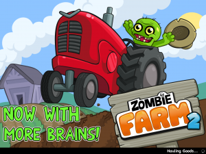
For example Zombie Farm by originally had a wither mechanic. However the sequel was changed to be an early bonus system - i.e. when you returned to Zombie Farm 2 on time you got a freshness bonus, but no matter if you returned a week or month later you never lost all your crops outright.
This type of system gives the player a warm feeling, one that the game is on your side.
Update - a great comment on the article by Nick Bhardwaj brought up Clash Of Clans having a subtle wither mechanic with troops, which need time to be produced but can be lost via PvP. Personally I’d describe this as a core PvP loop rather than wither - there is no way to securely “bank” your troops for use later (shield is something separate), and there is also no attacking done by the game itself, just other players. Fear of loss and the need to revenge are very strong drivers in all online battle games. His take was that Supercell encourages you to return and immediately “spend” your troops, which is more positive than the environment taking them away ie- its a more upbeat multiplayer twist on an established mechanic. Interesting discussion.
Does wither still have a place? Love your feedback: or
Catch up at GDC

Quick one -
I’ll be spending the full 5 days at GDC next week.
If you’re coming and would like to catch up do ping me at
See you pirates there…
Simon
Pleasure, puzzles and chimpanzees

I took the train a few times last weekend, and on every trip I saw people playing both Candy Crush Saga and Puzzles & Dragons.
Both are very different in style and mechanics, but at their core they’re both puzzle games.
If we look beyond mobile, millions still play Sudoku, despite the “fad” being close to 10 years old. And countless millions more enjoy filling out the daily crossword puzzle (yes, newspapers still exist).
Why?
Studies have shown the release of dopamine associated with solving a puzzle - the aha moment - clearly there's pleasure in puzzles.
Humans only?
A fascinating new shows how ingrained into our evolutionary makeup this behaviour is.

Research by the Zoological Society of London using a game designed with dice, pipes and holes found that chimpanzees are motivated to complete puzzles even in the absence of external rewards.
“We noticed that the chimps were keen to complete the puzzle regardless of whether or not they received a food reward. This strongly suggests they get similar feelings of satisfaction to humans who often complete brain games for a feel-good rewar.”
- Fay Clark, ZSL researcher
The fun of solving puzzles appears to be wired deep.
Double the pleasure?
So does the pleasure come just on completion of the task? And does it only flow in one direction?
Other has shown the that being in a playful state can help solve puzzles more easily, and interestingly, anticipating solving a puzzle puts the brain into a more open and pleasurable state.
So in addition to the satisfaction of finding a solution to a difficult level in CCS, there is also the sweet anticipation as you start loading up the game and prepare to play.
What does it mean for game designers?
So does that mean we should drop our space battle, shooters or farm games and all switch to Match-3 puzzlers?
No, not really.
But some takeaways I’m thinking about:
- Games that align with human “brain wiring” are more likely to do well
- There’s more opportunity to meld puzzle games into other game genres to make them more addictive (this is an interesting one I’ll expand on in a later post)
- Puzzles can often lose the fun factor easily by being too easy or difficult - the researchers from ZSL could and did increase complexity by making pipes opaque and balance difficulty for the chimps. The trick is to be positioned between apathy (too easy*) and over frustration (see Mihály Csíkszentmihályi's on “flow”). Note - this state of energized focus is different from mindless repetition which can be associated with hypnotic states.
- To get people to do better in your puzzle game and enjoy it more, go for playful loading screens and audio to get them in the mood
- Animals are smarter than we think :)
What’s your take on puzzle games? I’d love to hear: or
8 startup lessons on working with big brands
Note - this was a guest for TechInAsia, a great site for APAC startups.

If you’re doing a startup, there’s allure to a big brand partnership.
You might think: close a deal in a couple months and then prestige, validation, press, growth, new opportunities etc…
“If I get this deal we’ll be up in the bright lights!!”
Except it doesn’t usually work that way.
The reality is more like:
- getting a foot in the door is hard
- getting to a signed contract is grindingly tough
- getting a successful partnership that delivers real mutual value is the real challenge
- doing this all without getting sidetracked and “accidentally” burning your precious runway… hmmm
Our success and failure
My startup has worked with a few large brands in the past year. One failed draining precious cycles. A couple though turned much better, including a successful collaboration with media giant on new game , launched after months of hard work.
Here are some 8 startup lessons learned:
Lesson #1 - Press is overrated.
If your main goal is “buzz” that will lead to more downloads / users / revenue for your startup, brace for disappointment.

Even a mention in major media such as Tech Crunch translates to only a temporary spike (we’ve seen this). A friend got a top tier celeb to promote his new startup, resulting in far less returning users than he hoped.
We all remember glitzy press launches for projects that end up failing a year later. And those that rose to success without PR. Our new game got only a of editorial pieces but has still grown well despite it.
Whilst press can help for other reasons (eg- fundraising), a partnership is a pretty risky and resource grabbing way to try and achieve those goals.
Press is icing on the cake, rather than the cake itself.
Think about press as a great bonus only - if you don’t get it, no worries, a solid project will still thrive without it.
Lesson #2 - Is your opportunity cost acceptable?

Doing any project with a Fortune 500 company is going to take more time than you expected. Much more time.
Our project took nearly 6 months to deliver, and that’s fast.
Big brands need multiple approvals with different stakeholders, reviews with marketing and legal, endless back and forwards on product etc
If you’re a small startup and think you can create a brand new app for a brand whilst maintaining momentum on your “main” business, think again.
You’ll need to either hire up, rework what you already have, or try to turn your tech into a platform…or accept that THIS is your startup, and that your prior project will have to wait, perhaps forever.
Our project that failed in the end turned out as a good thing for us -whilst famous and adored brand to be associated with, it was turning into a large departure from our existing path (high opportunity cost) without enough strategic benefit.
Lesson #3 - Work with the right advocates

In a big company, it can be easy to find groups who may be interested and engage you in promising discussions that end up stalling.
Before committing lots of time with a group, some good questions to ask:
- What is the group’s mandate and business goals?
- Do they have budget?
- Do they have buy in from the relevant business units?
- Have they executed a similar project?
- Who signs off on a potential project?
- Do they have resources to commit to the project?
- Etc
In our case, we found an innovation products group who had a track record of projects and getting buy in from the different Conde Nast brands, and brands willing to embrace a new project - which got it all started.
Lesson #4 - Define your scope up front

Whilst in lean startup land we work iteratively and adapt, doing this with a brand that changes scope every week is a recipe for chaos at the least.
Small innocent requests - “oh can we add a module to let the customer redeem coupons through the website as well as the app?” can snowball.
Though there are pros and cons, I think it’s better to agree a list of deliverables and put it in writing early.
But how do you get it “right” from the start?
A good way is to either adapt from something that is proven to work (we based the new game on a mechanic from our first game) or do the upfront customer development and planning work to make sure it has as high chance as possible at success.
It’s a tricky one.
Lesson #5 - Harness the supertanker.

Big companies have processes, legacy and move slowly.
Startups are lightweight speedboats, deciding and moving quickly.
So what gives?
The natural instinct may be to try and bend the big company to your way and pace of working. This will lead most likely to frustration. Yours.
Instead, adapt to their way of working and get the big supertanker pointed in the right direction and let it power through.
For example all our normal task planning is through Google Docs. On the other hand, our partner did planning through Excel spreadsheets and a project management system. After a while, we just ran with it, and made sure that ALL the things to make the project succesful were included.
Once they were “locked in” the system, they just got carried through their usual process and happenes. If you focus less on the “how” and more on the “what” you can make the big company ultimately work for you.
Lesson #6 - Get the term sheet in place early

Legal contracts are one of the least enjoyable things a startup CEO has to deal with (after emptying trash and 4am server down emergencies).
Crawling through pages of minutia to spot potentially lethal gotchas doesn’t help you make your app even better.
And you may, like me, suck at it!
I’ve found a couple of ways to lessen the pain:
- First, get to a simple term sheet with the key points agreed up front, that can be signed off and act as the letter of intent. This should be no more than a few pages written in plain English. Once you have this in place, you can commit and focus on the project, and in parallel take your time with the legals.
- Get experienced mentors to help review the deal and legals. In my case with Frenzoo, I’m lucky to have a few angel investors who have plenty of experience in contracts, and act as sounding boards and sanity checks. It also helps to have a lawyer or two on your investor or advisor team (pro-tip, thats a HUGE advantage for an early stage startup)
Lesson #7 - Secure a budget.

Startups think burnrate, but big companies think budgets and headcount.
Are they going to contribute marketing to the project? Then what budget will be spent, by whom and where?
Are they going to be doing part of the work on the project? Then who is allocated and for what percent of their time?
Ensure your project has resources allocated and if not, ask nicely for it. If they are not sure, then request a good number and discuss from there.
Having these in place rather than a “best effort” will increase the chance of making it a success.
Lesson #8 - Does your head and heart align?
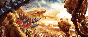
Back when we were still doing virtual worlds, we did a collaboration with Weta. As a big fan of Lord of the Rings & King Kong etc I loved this deal!
We would collaborate on a contest to promote their steampunk sci fi brand. The problem? Our audience, mainly women, weren’t into that genre. Despite it being well executed, it didn’t either make our service more sticky nor drum up more buzz for their brand.
The lesson? At the end of the day, only go ahead with a partnership if it really makes sense at both emotional and business level.
If head and heart line up, chances are it’s worth to pursue. Good luck!
What’s been your experience? I’d love to hear: or
Friends and Game Progress
Progress with friends
Count me as a fan of Candy Crush Saga on .

The folks at do a great job. Much fun is the over the top (and slightly creepy) presentation of a much-loved tile matching mechanic. But I also love the transition between levels on the Candyland map and being able to see my progress vs Facebook friends:

Woohoo level 10… see ya Mike…

Um… Charles, Angus, Sana and Mary, you guys have too much time on your hands *_*
Air’s thin up there
Seeing your Facebook friends* in a game can be a strong motivation to continue on the grind of a game.
* For many hardcore players who use dedicated Facebook game accounts with non irl friends, I think the argument still holds. You often have as strong a bond with them through other games spanning many years of your life
But it’s increasingly the case that:
- Your FB friends won’t won’t be all playing the the game you are
- Of those who are, only a couple might be at high levels
This presents a question to game designers who spend many cycles on high level systems and players, those who bring in the big revenue.
On one hand you could argue that the real friend social layer is only needed to get you addicted to the game and helping the viral coefficient a bit, and once you’re up there at high levels the meta game and game-specific social components (friends, guilds, challenges, events etc) take over.
But to me it seems strange to have two separate friend layers within a game - Facebook and in-game, often used in different parts of the UX and game systems.
A marathon model?
Imagine in a game like Candy Crush Saga if that instead of showing a ever thinning list of FB friends as you progress up through the levels, you blend in-game friends (and foes and strangers) into the progress map.
It could be done programmatically.
A sprinkling of high level players, with serious bling showing the spoils of progress, as well as those with a similar cohort, trajectory or level to yours, to encourage you to keep on moving (analogous to how Clash of Clans throws high level players occasionally into the random PvP matching as well as those ranked similarly in level to you)
The way I see it, this model could be like a marathon:

- You may have a handful of friends or people you know also running and motivating you to join, but they probably aren’t all running with you through the whole race
- You have the high level runners at the same event - the ones you admire on the big screens and in your dreams aspire to become one day
- But most of the time you are surrounded by folks running around you - some may be and remain total strangers, others you may develop an unspoken but real emotional camaraderie as you compete, but also drag each other to continue through the gruelling miles
All of these three groups are different, but aren’t they all runners in the same game?
Should FB and in-game be treated the same? I’d love your feedback. or .
Death of a feature
Recently we bid farewell to a new feature…
It was a cute feature, one we liked. But at our morning metrics meet we made the grim call. When the daily Android build went out hours later, it was gone.

Sunsetting a feature - how to decide?
“Stella’s Assistant” was designed as a basic plant & harvest currency mechanic. Players would start a job from 5 minutes to a day, and get paid once done.
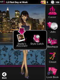
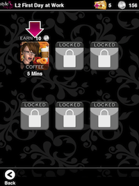
It was a small feature, an MVP hacked together on an assumption it would increase retention, helping remind players to return to collect their coins from Stella.
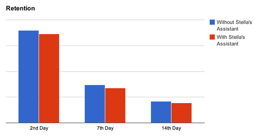
Other retention features we had launched performed well. Yet after launching it to our usual A/B test we found retention actually decreased in the group that had Stella’s Assistant, vs the control:
And to top it off, monetization also dipped:

We first verified the test was statistically significant. Next we thought it might have something to do with economy balance and tried with different payout values. Yet in no A/B test was the result positive.
Should I stay or should I go? Some tips to decide
When a feature under-performs like this, there’s a binary decision to make: iterate it or drop it.
How do you decide? Some questions to consider…
Is the feature meeting its stated goal?
It’s good to have a goal for each feature, preferably a specific number. eg- lift 7 day retention by 5%. Then when you release it you can see clearly whether it was successful.
In our case, the answer was no. The numbers don’t lie and for a feature designed to improve retention, to have it dip down, albeit slightly was pretty damning.
What is the underlying reason for its under-perfomance?
Often, numbers tell the what, but not the why.
In talking with players we found Stella’s Assistant just didn’t add much to the game. Whilst extra coins were nice, it felt like a weird farming sim feature tacked on to a fashion game. It also made the UI busier, and introduced an extra menu layer and more taps, pulling the overall experience down.
What is the opportunity cost of iterating?
As a startup, every developer hour counts, and the question is whether trying to improve the feature would have a bigger impact on metrics vs using that time to develop something else.
Apart from metrics impact, you have to weigh up the ongoing additional cost of testing and support.
In this case we weren’t convinced iterating it would move the needle much, and we had several other features that would have a much better “bang for buck”.
Does it have strategic value beyond metrics?
Some features may not improve the numbers, but may still have strategic value.
For example, a device registration system to stop cheating, an icon promoting a partner, or a parental safety feature that stops inadvertent payments in a kids game and builds long term trust.
In our case though, there just just wasn’t one.
Final tip - stay positive!

Abandoning something you have worked hard on, whether for a few hours or a few weeks is never fun. Us humans deal pretty badly when it comes to loss, including that at our own hands.
The key though is to stay positive, and realize you may have lost a feature but you gained a real learning - one that can only improve you and your startup going forward.
So, Stella’s Assistant rides the slow boat to Valinor and for us, the adventure continues :)
How do you decide when to kill a feature? I’d love your feedback. or .
Creating a game brand - 5 questions to ask
For a startup game company, does brand matter?
A while back I sought wisdom from a group of experienced tech entrepreneurs, all of whom had built successful companies:

That makes sense.
Why build a brand?
In an age of and cluttered app stores, having a strong brand for your portfolio is more important than ever.
Increased brand equity to increased customer lifetime values.
A strong brand will convert better in cross promotion and organic adoption of apps from the same company, offsetting rising CPAs to individual titles. A friend at a large mobile studio with many games, estimated the brand uplift factor to be over 20%.
And basic brand building doesn’t cost that much, making it startup friendly.
Yet why is branding is usually the last thing on our minds?
6 months ago I would have counted myself in the “product is the ONLY thing that matters” camp, yet now I’ve switched camps…

These may be great games, but would players know these are from the same company?

On the other hand, how could a player who enjoyed Tap Paradise Cove and loves cute animals NOT want to play Tap Pet Shop?
How to do it?
Ok, so it’s important, but for us engineers or designers, where to start?
Having gone through the process with , I found working through these 5 questions was very helpful:
- Who is the target player & market?
- What are your core brand attributes?
- What does your brand stand for? (emotional connection)
- What will identify your brand to players?
- What games and features strengthen the brand?
Let’s go through them one by one:
1. Who is the target player & market?
Yes, the easiest one! You’re making a game, you should have a primary audience in mind. eg-
- We’re making strategy games for high income males over the age of 25
- We’re making lifestyle games for adult women
- We’re making racing and sports games for boys up to the age of 14

What if you believe you’re making the next Angry Birds, a game that will be popular with literally everyone?
Creating a game like this is difficult. While you might strike it lucky, your chances for success and monetization go up if you create games designed and branded for a target group of players. Even mega hits like Temple Run and Words with Friends have their primary markets (teens and adult women).
Defining player personas, who you’re building for, lets you really dig in and understand:
- Who are they?
- When do they play?
- What do they play on?
- What other media do they consume?
- What issues are important to them?
- What challenges do they have in their lives?
- etc
2. What are your core brand attributes?
If you had to pick (and you do!) what are the 2 or 3 things that are unique to your brand. Put another way, what makes you different from everyone else out there?
Let’s look at some examples from mainstream:

- Toms - style with a social conscience
- Nike - personal achievement
- Walmart - large selection and low prices

- Personal - games that relate to my life
- Playful - games that can laugh at themselves
- Inspirational - positive games that inspire me

Once you have gone through this and settled on your brand attributes, it’s like you’ve found your North Star. It will help guide you in decisions from here on out.
3. What does your brand stand for? (emotional connection)
The strongest brands form emotional connections with consumers that often override logic and reason.
Low cost rubber and fabric stitched in a factory in Indonesia can inspire people to “Just Do It”. People will queue for days for the latest iDevice. Overpriced headphones from Beats convey urban cool and freedom from authority:

It opened our eyes - when we A/B tested taglines for Me Girl, we found emotional phrases like our final choice “Fabulously Me” converted much better than impersonal choices like “Games with Style”.
“Fabulously Me” sums our mission: to make women feel fabulous while playing our games. Regardless of age, looks, body shape, status in life, challenges…everything.
This is what our brand stand for.
If a brand stands for something - Freedom. Challenging yourself etc., chances are players will care that much more in return.
4. What will identify your brand to players?
Once you’ve locked down your targets, brand attributes and emotional connection, it’s time to bring that to life visually.
Creating a match of logo, typography, color palette, audio, UI elements and animations in a cohesive experience that conveys your values is the goal. Honestly, it’s easier said than done (we have a ways to go) But we just consciously going through the process will often result in something good.
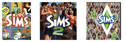
The venerable line and their “Play with Life” proposition does it extremely well, with consistent visual elements that a random 20-something on a street could identify in a second. And their music and audio right including their quirky Simlish reinforces a unique personality.
As we’ve seen with the Sims, branding elements that anticipate and can weave into future games, expansions and sequels is also important. Even more so in the age of mobile with more releases more often.
For us a future “Dance Me Girl” or “Me Girl Dancer” would fit nicely into the same family from a cross promotion perspective.

5. What games and features strengthen the brand?
Consistency is key - whether in art, storyline, mechanics, humour etc.
If decided to sell your personal info to shady direct marketers, how would you feel?

Likewise if you’re someone who enjoys Bubblez on and returned to find them pushing a hardcore dungeon raiding MMO, you’d probably be confused.
These are extreme examples of course, but there are plenty of choices that we all face every day:
- should I add a feature to simplify UI but reduce freedom in my simulation game?
- should the game be balanced to encourage free players or heavily favor paid users?
- what types of ads should I be showing in my freemium game?
- should I add a feature that lets you lose a lot of real money investment in PvP?
- what should my next game be?
- etc..
Knowing your brand values often helps in these questions - ringing an warning bell when you’re heading down a wrong path.
For example we could add competitive systems where you systematically tear down the reputation of others. Whilst “fun” from a game design perspective and helping short term numbers, it wouldn’t align with our “positive and inspirational” feel.
And on the flip side, carving out cycles to do brand building features that might not directly boost metrics but help players fall in love with your game brand can be worthwhile.
An ongoing endeavour
As we’re understanding, it’s not a one time activity - building a brand is an ongoing sustained effort that spans from game design, to engineering to marketing and even customer support.
Of course a great brand can’t rescue a bad game and it’s always a tough call to put precious cycles into something you haven’t before.
But assuming you are making good games, investing in brand building can add up to huge wins in the long term.
Any branding tips to share? I’d love to hear your feedback. or
Big thanks to our investor whose Mattel experience made us “see the light”!
Needle in the haystack

Think it’s hard finding engineers?
Try finding a for a startup that makes mobile games for women.
Your wishlist might look something like this…
- Someone who has deep games experience, but there are so few gaming companies that have done high quality mobile games for that audience.
- Someone who has a fashion industry background and a keen sense of trends and style - yet the worlds of fashion and gaming are proverbial ships in the night.
- Someone with a global perspective - knows the US audience yet is tuned in with innovation out of Asia (where our development team is based)
- Someone who can understand the vision for our brand (our ambition for that honestly scares me sometimes), and drive forward in unchartered waters
- Someone who loves startup life - rewards and risks
Needle in the haystack enough?
After a couple months searching, we interviewed several talented artists, but few with the other elements. Great people for building out the team but not the lead creative role.
Always “so close, yet so far”.
Yet in the end we managed to find someone who brought all the pieces together.
Fashion design, deep love of games (everything from Star Wars Galaxies to Mall World). A third culture kid (fellow Eurasian!) who draws inspiration from the US, Europe and Asia.
The funny thing was, she turned out to be one of our original fans. On our web 3d world Frenzoo.com, she created a popular vfashion boutique under the Sheeana avatar name. She knew our project from the start, and kept up we pivoted from web to mobile.
We ultimately found the candidate with the best experience and passion for our project was one of our players.
Learning: occasionally the best talent is right in front of you, if you only look
Have you had success hiring one of your players? or
