Image for a minute, one of the U.S.’s Top Grossing iOS apps.
A freemium game that has stayed top of the charts for the last three months.
Like me, you might imagine a title with gorgeous HD graphics, slick UI and a lush soundtrack?
You’d be mistaken.
In fact, the first time you play by Japanese developer (published by ), you might think you’ve downloaded another app by accident.

The visuals? Mangalicious, but low def only.
The UI? A web port with text, links, buttons and banners on often long scrolling pages.
Audio? This game doesn’t have any. Really.
But that doesn’t hold it back.
Rage of Bahamut (RoB) is a triumph of game mechanics over glamour.
It’s million dollar proof that depth counts (that should make us game designers happy :)

Up at the top of the ranks since launch
Here’s my attempt on breaking down some of the key elements that make it such a monetization monster.
Mobile-Friendly Core Game Loop
First the bread and butter.
RoB is a collectible card game (CCG) with a very solid core game loop:
- Quest and battle (pve and pvp) using sets of cards, which have various attributes.
- This gives you resources: soft currency (rupies), items, treasures, cards and XP.
- In turn these give you the ability to increase your level, acquire and upgrade cards.
- Which lets you quest and battle vs more difficult opponents and get better rewards.
- Repeat.


It’s a simple to grasp concept that let’s players get right onto an addictive levelling grind in the pursuit of making progress.
Being a numbers heavy game (no actual combat or real time skill involved), there is plenty of depth for stats obsessed gamers to dive into.
By it’s nature it fits well for mobile gameplay.

The game:
- is easy to grasp and UI works well on a small phone screen
- has a vertical orientation makes it easy to play with one hand
- can be played in small snippets - actions don’t take long (eg battle in <30 secs)
- can be resumed with minimal real time elements (eg- change trains, go in a lift)
It’s a foundation that sets it up solidly for all the monetization* elements we’ll go into next.
* RoB also has a bunch of well executed retention and viral features (can I interest you in my referral code?) but that’s out of scope for this post.
IAP removed time restrictions
Ok, like all modern social games, RoB restricts how long you can play in a session, a limit that can be removed via IAP:

This is implemented through two main mechanisms - Stamina (used for progressing in pve quests) and Attack Power (used for pve boss battles and in pvp).
Both are consumed through actions, and regenerate at a rate of 1 per minute.
Both can also be refilled through hard currency (rage medal) acquired consumables: “cure water” and “holy power” respectively.
This basic mechanism motivates players to spend to reduce waiting times, and helps pace the game for free users.
Gacha and collection mechanics
Next, the gacha.
There are several types and many hundreds of cards in RoB, each with different attributes and maturation and evolution states.
All active players have a drive to gain better cards be it through gameplay, trading or card pack purchas - a key monetization driver.
Players can purchase card packs in the prominent position on the right of the UI header bar:

A card pack (there are several kinds) contains a set number of random cards, and there is always the small chance to get rarer (more powerful) items.

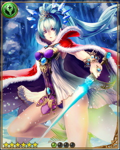
For example, there is a small chance that an SS Rare card like the Crystal Queen above may drop in a beginner legend card pack. There are at least 8 levels of rarity in the game (including normal).
And even if poor cards are received, they can at least be sacrificed to help upgrade other cards, reducing the psychological sting of drawing a bad set (more on that later).
All up it’s a solid casino mechanic that plays on the notion that you might well “strike it rich” in your next Card Pack. And it doesn’t hurt that Card Packs cost quite a lot of real money.
On a related note there are also collection drivers within the game, with bonuses awarded in case of a set completion.
One example -
In questing and pvp (you can target specific items from opponents) there is the chance to obtain an item from one of the treasure sets, which when complete give you a completion reward. This also carries over to events, where set completion unlocks bonus items.

Collecting of cards is also popular, as a result of the next topic…
Deep upgrading system
RoB includes a couple of systems, commonly used in conjunction that encourage you to source and consume cards to help make other cards incrementally stronger.
This has the net effect of encouraging more gameplay and monetization sinked through the card upgrade system, that plays into the desire to make good cards “that much better”.
The first- enhancing is a way to upgrade a cards level and battle stats (attack and defence) by sacrificing other cards, called feeders.

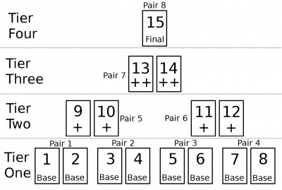
The second- evolving is a way to combine two cards of the same type to a more powerful version of the card - there are normally 4 evolution levels, and at the final level the cards rarity also goes up one level. The 4 levels are represented visually by different graphic versions of the same character, as in this Archangel example:

Like an an RPGs recipe and crafting system, these systems can be used in a variety of interesting combinations, yielding different results.
The systems also operate on a “law of diminishing returns”.
Cards have maximum rating, and increases towards a maximum require a greatly increasing amount of resources.
A maximum card evolution with only a few enhancements might deliver close to 98% of maximum, but to squeeze the last couple of percent up to 100% could take an enhancement investment of 15 (ie all cards enhanced in the evolution process).
Perfect for perfectionists :)
An analogy might be world class athletes, competing and training more and using increasingly advanced technology to shave off ever decreasing milliseconds off world records.
This makes it an awesome sink especially for its target audience, and combined with PvP participants competitive natures a strong monetization driver.
Well executed tutorial
Despite cheesy lines and endless tapping, the tutorial is strangely endearing, and more importantly introduces the player early to the key monetization systems - gacha, card packs, card upgrade and PvP, via a simulation with the guide npc.

Also subtle, the realm choice at the start of the tutorial uses your personal preference to drive the first sense of alliance and community. I’d say it represents the first emotional investment in the game, and players are generally more receptive to pay if they are hooked in emotionally.
PvP - revenge, proactive revenge and competitive spirit
Like other top grossing games (think Kingdoms of Camelot or Backyard Monsters), PvP goes deep and is a key part of RoB’s success.
Players can battle each other (your attack strength vs their defence strength modulated by various skills/effects) and by winning, gain among other things, currency (a percent of the losers liquid amount up to a certain value) and treasure.
Whilst there is some protection mechanisms so that lower level players don’t get beaten down by much higher level players, beyond that you have the chance to attack and be attacked, with impact.
This encourages players to spend to money to increase their attack and defence scores.

PvP can also get personal - there is a strong human reaction (dust off the evolutionary psychology theory) to a loss inflicted by another, even more than a positive emotional impact gaining something. Rivalry and in the evolutionary context, putting a wayward tribe member back in place I believe motivates even more monetary investment.
Feeding from that fear of loss, the game also lets you buy insurance (proactive revenge) for your treasure items (currency can be indirectly protected in other ways). The game lets you buy a magic circle to place on your treasure items. A magic circle fires once when that item is targeted by another player, automatically inflicting a loss on them.
Beyond the direct PvP battle system there is also a meta game available for players over level 10 (where some of the deeper monetization systems kick in), with a leaderboard of battle rankings, compiled using another attribute gained in proactive and defensive PvP. This is used to determine the best players during that time period, and based on their placement they are granted another currency, gems, that can be then redeemed for items and even more powerful cards.
Battle leaderboards are reset regularly, encouraging ongoing level of competition and investment in the game.
Guilds and guild PvP
Continuing on the PvP theme, one area RoB has done particularly well is their implementations of guilds, or in their terminology, “Orders”.

Only available to more established players (level requirement), orders let players join and then ultimately form their own groups, complete with leadership, roles and hierarchy.
Orders enable encourage investment in a group via a donations mechanism, and the leadership can also construct speciality walls and buildings that confer attribute bonuses to all members.
For example, a church constructed by an order can boost all God realm cards attack and defence by 5%, for a cost of 3 million Rupies.

Like players and their cards, orders themselves can be leveled up through group donations which has the impact of increasing the maximum number of members up beyond 30, which is useful in guild PvP.
Guild PvP is implemented through a “Holy War” system, whereby an order declares war during a set time period, and is matched automatically with another order (I didn’t figure out that algorithm), triggering a time limited event where order members battle each other, with resulting rankings (tabulated by a guild PvP specific attribute, Holy War Points) that ultimately translate into more cards.
The guild structure and guild PvP system in RoB have several benefits to monetization:
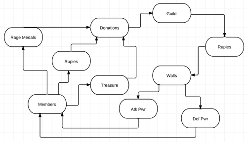
- A loop of helping a guild which helps the player which helps the guild etc
- Guild events and structures give a reason to spend to help the team performance
- Guilds communication tools eg forums facilitate economic activities like trading
- Guild leadership roles encourage more investment by those members
- Encourages patronage relationships where senior members desire to help others
- And of course a strong social bond (shared struggle, shared rewards) that encourages higher ongoing retention
Note - In addition to the order guild system, there is also a personal group system (everyone gets a guild!) called Fellows. I won’t go into that in this post as I understand it as more of a viral/sticky tool rather than directly monetization related, but indirectly helps monetization through mechanics where fellows leader cards can assist in certain attacks. ie- we upgrade and can help each other in a reciprocal manner.
Ongoing events
Events are key - keeping the game evergreen and encourage returning play and introducing new goals to drive towards.

In a recent event, players were encouraged to stop evil entities from using magic moon tears
In addition to guild PvP events (Holy Wars) there are also PvE events that encourage team work, and encourage purchase towards event specific cards which help in the specific event they appear in.
The loop is obvious and direct but appears to works, especially when caught up in the thrill of the shared event (would be interesting to see if an indirect system would have fared better)
Events also tie in with normal grind mechanics (eg quest system) but with typically additional random effects that let players participate for longer. This also ties in with a gacha mechanic whereby random rewards are assigned at random times.
Whilst a lot of work to implement and manage (there was a community uproar over technical issues in a recent event) the monetization impact particularly to dedicated paying users looks strong.
Item trading and economy
Last but not least RoB features a robust trading system and with it a simple but effective economy with de-facto item exchange rates (eg- to consumable items). Players can freely trade currency, cards and items with their friends.

As player activity “generates value” through upgrades and random drops through extended gameplay, that value can be transferred between players. Psychologically this can mean investment in upgrades, grinding and collection is “worth it”.
This also adds another dimension to the gameplay, allowing players to participate in a (often as satisfying) meta game of trading, profiting from sales as well as purchasing desired items directly.
Whilst in theory trading might be seen to reduce high end paying user monetization as it gives an option to purchase from another player (who in theory may have been farming for free) rather than directly from the game, converting free time into paid value, in reality it plays well with the random drop and upgrade nature of the game, encouraging more collection and investment in the game in general.
Summary
I believe Rage of Bahamut succeeds because of its excellent game design and deep systems that directly and indirectly drive monetization.
Put simply there are many different reasons and ways to spend your money.
It’s a great match to a high paying demographic and is implemented in a way that is mobile friendly and of course, fun :)
ps - wrote this post for personal interest to understand about monetization in CCGs, an old genre that’s new to me (grew up with D&D, not Pokemon!)
Thanks to Adriaan and other players for helping me understand the game better and also big ups to the RoB Wiki.
I’d love to hear your feedback. What did you think of the game? or
Video from my at Casual Connect last month is now up:
1 Million Downloads in a Month – How Indies Can Make It Happen
Always trying to learn more - what other tips would you have included?
Ping me on or .
ps - new blog posts coming this weekend :)
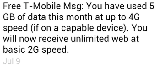
I recently got this friendly text from T-Mobile:

Only slightly peeved, I called to ask what upgrade or top up I could get to restore my speed. I was told, being on the highest volume plan already, there was no option. I had to just bear 1990’s style internet access while waiting for the next billing month to start.
I was willing to pay, but there was nothing to spend on.
Quite peeved, this got me thinking back to a game design issue - how to fully meet demand from paying players. After all it’s normally easier to increase ARPPU than paid user conversion rate.
Take our title . The core puzzle mechanic with energy based currency earning requires serious patience or skill to finish the game for free.
So most players who reach into the end-game are paying. And the majority of who do finish the game enjoy it and want to keep playing:

What’s the solution we offer today?
Well you can go back and try and get 3 stars for all levels like in Angry…Amazing Alex.
Or just sit tight and wait until the new levels hit, whenever that is. Tomorrow or maybe in two weeks. Dear player, cool with that?
Oh hang on…. we’re guilty of… that makes us just like…. T-Mobile! *sob sob*

Drama aside, what are the sort of things that could help?
The good news is that there are LOTS of tactics in this sort of case. These include:
- More content, on a faster cycle (no brainer)
- Parallel spending on multiple characters / pets etc
- Parallel spending on multiple attributes, with accompanying mechanics
- Random drops to encourage speculative consumption
- Premium content, time limited or otherwise special items
- Item upgrading, crafting and customizations
- Adding more and varied time gates to gameplay
- Branched story overlays to increase fun of replayability
- Programatic goal generation (this is tough to get right, just ask D3)
- Community and PvP play to give new play goals
- etc
Some really interesting stuff here, I plan to dive into a handful of them in future posts as we design and roll them out.
Bottom line:
Whether you’re T-Mobile or Tiny-Startup, don’t leave money on the table.
How do you give paying players more to buy and enjoy? me or

For startups & game companies, it IS a war.
One fought with stock and salaries, massages and medical plans.
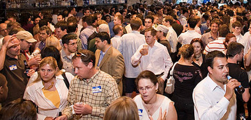
At an event in San Francisco last week, chat swung from banter to business when one of the group started an eager pitch to another, a talented game dev. The rest of us slunk away like friends leaving a flirting pair in privacy.

Back in Hong Kong it’s less crazy, but demand for quality talent still exceeds supply.
So how to compete?
Earlier we tried hiring an engineer position the time efficient (ahem…lazy) way - throwing up a vanilla job ad and waiting for CVs to roll in. We only received 8, none up to our standards.
Now with several to fill, fast, we resolved to do much more this time around.
Here are 10 tactics we used:
1. A fun referral program
We decided to slipstream off the recent Retina Macbook Pro launch by offering a new Retina iPad as thanks. It seemed to work, with several folks getting in touch and introducing their friends. We even had a random person coming to the office to drop a CV which was a first for us.

2. A personal email blast
To help spread the word, we pulled together a mass email to friends and connections we’d met. We started with a large list, filtering out those outside of Hong Kong (exporting from LinkedIn) and culling other game companies (no bad karma).

Whilst I couldn’t track open or click rates as I decided to use casual plaintext, the number of people who replied was over 15. So for a cost of around $5 it was a good investment.
3. Promote the jobs in-game

Having gained a nice global audience including Hong Kong, we decided to reach out . We have a dynamic welcome message that can be displayed on loading, and we coded it to display the referral program and contact email for those playing from Hong Kong. Sadly it was hard to tell the impact. In hindsight I should have put the call to action as a different address eg- to track the impact (note to self for next time).
4. Host and speak at events
One thing we’re doing more of in the last few months is having the team host and speak at more industry events (like held together with Unity3d at Cyberport). It’s good for the crew to hear from others and share our own learnings, and spread the word.
5. Targeted Facebook ads
Whilst the cost of posting a job on LinkedIn and Monster (not to mention a recruiter) would have been high, we found it more cost effective to do a targeted Facebook run. Of course the beauty of Facebook ads is the ability to hyper target based on location, demographics and interests. It’s something we’ve used a lot for different purposes in the past. Whilst the CTR is low as expected, having it in front of lots of relevant eyeballs helps in background brand building.

6. Give the company a face
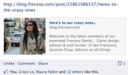
A big draw for working at a startup is collaborating with a fun, smart team, unbound (hopefully!) from bureaucracy. A intro’d the awesome new folks joining the family and gave a sense of the vibe. This got good buzz out in the community…

7. Participate in Hackathons and Startup Contests
For programmers hands on events like hackjams and startups weekends are just a whole lot of fun and great chance to meet kindred spirits. Two of our team recently entered and won a Facebook hack day in Hong Kong. Working with an award winning team is one extra draw for potential recruits, and something we now highlight. How much does it help? Who knows but sure can’t hurt…

8. Get press
How to get press coverage? That’s another post which luckily my friends at Buffer have . You don’t need a million users to get that - it helps, but frankly not as much as an interesting story angle. Startups almost always have compelling tales and takes, so usually there is a pitch that can get coverage.

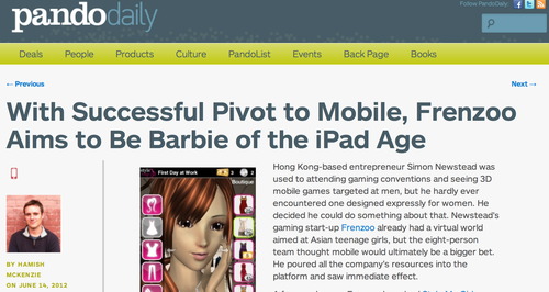
In our case we recently got coverage by several great . Doing PR costs less and only takes a few hours of creative thinking (more on that for another day)
9. Look at adjacent segments
If the need is niche and competition fierce, it may be better to look out to adjacent fields and skillsets. One of our shortlist game designer candidates ends up being someone from the fashion industry and she just loves playing all sort of social and mobile games. A reminder it always pays to…
10. …think outside the box!
Lately I’ve seen some great examples of startups thinking different in recruiting talent, from offering (expensive) through to (cheap).

You may not come up with something that makes the front page of Hacker News and a gazillion page views, but chances are just by making an attempt you’ll end up doing more than the other companies, which is half the battle.
And our result?
Going beyond the usual job ad generated more than 200% more candidates, at approximately 50% extra cost. Whilst it’s hard to isolate the impact of some of the tactics (mostly my bad!), all up it was worthwhile.
We’re able now to fill two of the three open positions. Still have to work hard to fill a final programmer position, but we’re in much better shape.
Lesson learned - when hiring, you usually get what you put in. Getting more creative and trying more things helped turn around our first failed attempt.
What tips do you have for hiring? me or
ps - for friends reading this in Hong Kong, and giving iPad’s for successful referrals… but you knew that already ;)

When I first of Greplin via a flurry of news from elite tech blogs, I fell in love.
Finally, a way to search all my stuff - Gmail, Google Docs, even Facebook in one single search - brilliant! And they were by Sequoia, generally a good sign.
The first weeks I used the service a lot but over time, less and less.
Why?
I found I didn’t need to use it that often, and when I did, I didn’t.
The handful of times I remembered to use Greplin though it worked pretty well.
In most cases though local and a search in one of the web services did the job. And in the rarer cases that didn’t work by habit I would go through them one by one until I found what I was looking for.
So in the end, something I thought would be a hit turned out the opposite.
What startup lessons am I taking away from Greplin’s ?
- Be a painkiller, not a vitamin (eg dropbox)
- Make something that people are going to use often (eg evernote)
- Hype is different from traction (eg greplin vs whatsapp)
- Give people a trigger to return to the service (eg icons, notifications)
- Make something viral or at least monetizing well enough to buy traffic (eg mint)
Goodbye Greplin, and wishing the best…
What lessons would you draw from this? me or
Your app icon is like a shop front, on a very busy retail street.
Warm and welcoming*, interesting and attractive and you’ll encourage people to wander inside and check it out Drab or shabby (drabby!) and few will bother to look.
* I mean seriously, who could resist that cute a baby ?
It’s clearly something people think is worth investing in. A co-founder of a top game company told me it took them 3 months to come up with the icon for one of their monster RPGs. For our first game we tested over 64 different versions on the way to identifying a winning .

One of the many tests we did over the course of several weeks
So how do you actually conduct an effective a/b test to come up with a great icon?
There are several ways - here are a few approaches in order of increasing accuracy.
1/ Good
One easy way to run a very fast and cheap test is to use a service like . They do simple A vs B tests, typically as a front end to a crowdsource platform like Amazon Mechanical Turk, where the participants are asked which they prefer.
Pros:
- Cheap
- Very fast
- Ability to filter by demographic
Cons:
- Bias of tester self selection
- Subject to participant self awareness
- Lack of real intent and context
2/ Better
Next up you can use a platform like . This let’s you deploy multiple versions in parallel out in front of many eyeballs and measure click through percentages.
Pros:
- Fast
- Ability to target by interests, demographics
- Less bias
- Flexible sample sizes
Cons:
- Intent and context is closer but not same as real intent
- Can cost a lot depending on sample size to get statistical significance
3/ Best
The best way to test is to actually test with a real audience in the context they would discover your app once launched (ie ads and appstore charts). For iOS and Android this can mean ads on networks including AdMob, iAds, inMobi, Millenial Media etc You don’t want to use incentivized channels like offerwalls as they aren’t an accurate measure of actual self-generated user interest.
Beyond just clickthroughs, you can also measure true conversion to installs and app opening, by integrating the ad networks’ SDKs. Ie- do the players feel your game description and landing page reflects what they were interested in, which was the icon. (A whole another story on whether the game matches to what they expected when they installed)
What if you app isn’t already launched? Then you can setup a separate test account and run the ads to point there. Android is good that way. Also you can restrict the test app and campaign to certain geographies if you want to keep it fairly low key.
Pros:
- Truly unbiased and representative audience
- Accurate context
- Flexible sample sizes
- Measure actual conversion
Cons:
- Takes time to integrate SDKs, approve creatives and measure - cycles are longer
- Can cost a lot depending on sample size to get statistical significance
How do you come up with a great icon? Let me know by or

It’s not often you get to hear from a game designer whose work spans multiple genres, from blockbuster social games like Farmville while at through to girl games hits like My Horse for the iPad and many more.
Raymond Holmes of gave a talk at the Innovation Lab last night on the different games he has designed and what he learned from them:
1/ Minimum viable product can be very “minimum” if you’re early

Farmville was pulled together in an incredibly short amount of time and with a very small team. It went to show that a MVP can be very “minimum” and still succeed, particularly in the era of freemium and games as a service with fast iteration post launch. He cautioned that it only works if the market is new, but given all the rapid evolution in gaming platforms these days there are likely to be plenty of situations where that remains the case - there are plenty of new markets that don’t even exist yet in gaming.
2/ Learn to think from a user point of view

One of his early gigs was helping design Barbie Team Gymnastics. The game did well and taught him “the important ability to design from a player point of view”. It was a game that clearly he wouldn’t enjoy playing himself, but he learned a lot about the actual players who enjoy that type of game and how they play and interact. That resonated with my own personal experience in designing .
3/ Leverage what you learned from the past

At Barbie Team Gymnastics, he learned a lot about gymnastics - animation, theory etc. And later when he was on the team creating Aeon Flux, it was decided the lead protagonist would be much more acrobatic, and his past experience led perfectly to the new game. His lesson? Leverage what you have learned and have an open mind to new topics - they could be useful in the future too.
4/ Monetization has to be appropriate to the audience

It was interesting hearing about his experience with My Horse - on one hand an extremely popular game with over 10 million downloads for iPad but relatively speaking, low monetization. Why? Because a lot of the level grind mechanics in the game didn’t match the audience - young girls and boys. They simply didn’t “get it”. In hindsight, his opinion was that it could have been better to have designed more of a pet simulator/dress up style of experience to match those who love the game. That said, it’s hard to argue with the success of a product that has driven that much traffic and surely a good amount of revenue.
5/ And finally… every game needs a WOW moment

Raymond made the observation that the moment players fell in love with My Horse was when they first saw the horse in the field, animating and interacting with the player - truly a wow moment that emotionally hooked them (we see that when players first see their stylist interact to their touch). He recommends all games try to establish a WOW moment early on in the experience to get them engaged.
All up, some excellent tips from a very experienced and creative talent.
Any feedback?
This is a repost of an article I wrote recently for Amazon’s app developer blog last week. The original is available
Guest author Simon Newstead, CEO of Frenzoo, discusses designing games for monetization. In it he uses examples from Frenzoo’s Style Me Girl, the first 3D fashion game on mobile. Simon can be reached at .
A Numbers Game
Our debut game Style Me Girl gained impressive downloads in its first two weeks, reaching the #1 position in the Amazon game charts. Whilst the downloads and rankings were nice, what made us really happy was the monetization, with Kindle Fire performing particularly well.
Mechanics
To look at what drives monetization it’s always helpful to look at the core game mechanics:
In our case with Style Me Girl, the primary is a fashion puzzle mechanic where the player must dress a series of models for different Photoshoots, each with a unique fashion genre. The game uses a proprietary judging algorithm to determine scores, taking into account the items used, the fashion genre as well as the attractiveness of the photo taken. Passing the level unlocks the next level (model and fashion genre), progressing the story. Story evolves with new levels added dynamically from the cloud each week.
The secondary is a casual “catch the falling item” mini-game called Style Catch. Style Catch escalates in difficulty and provides and increasing payout of coins, used for shopping.
A freemium game, Style Me Girl has a hard currency Cash (purchased via IAP) and soft currency Coins, earned in Photoshoots and Style Catch.
5 Tips for Monetization
1. Incorporate a storyline
No matter the game type, if your game has levels, story serves up more motivation for players to progress through them. Players are emotional beings, and we are all compelled to be drawn into a good story. In our case, the game could have functioned just fine without a story line. However we saw from player feedback a deep engagement with the protagonist and goals in the story arcs. Given how little engineering resource is often needed on story, the ROI to include it is usually pretty compelling.
2. Replayability and collectibles
One thing that drives many paying users of Style Me Girl is successfully completing all levels with perfect 3 star results. Why? Of course completionism plays a part but the main one is being able to win rare “signature edition” items. These cannot be bought in the shop and a sign of success is sporting an outfit featuring 1 or more signature editions. It’s always good to make room for replayability and collectibles can play well in that.
3. Energy and speed up
It’s a cliche but it’s true - impatient players are paying players. Energy regeneration through paid items is a proven way to open up the purse strings. We saw that in Style Me Girl and cash purchase, even though Style Catch itself is just a game to let you earn the soft currency. Strange but it works.
4. Aesthetics and functionality
Whilst studies show that pure aesthetic items don’t monetize as well as time saving and functional virtual goods, if you can combine them together that can work extra well. In our case the cash items bought in the shop are attractive fashions, which lets users both look good and play good. Combinations are always good. Think the success of Toms, based on looking good and feeling good about it. Or owning the latest Macbook Air, a style statement as well as solid productivity tool.
5. A/B testing
Like eating enough fiber, it may not be a glamorous part of game design but it certainly is necessary to get the most out of your game. We implement A/B testing in the major parts related to the in-game economy - coins earning rate, starting currency values, purchase conversion rate etc. We don’t go to the point of A/B testing individual item prices yet though, but that’s the direction. Running tests has helped us increase monetization while not affecting retention (not always the case), and it’s something we’re going to dive into even further.
Conclusion
These tips are certainly not rocket science and not the first time they have been used in games.That said, keeping these fundamentals in mind when designing your next game ensures you’re getting biggest bang for your development buck. And that makes everyone happy.
Choice is good, right? (re Destructoid)

Ah controversy :)
It stirs up emotions when it’s on a topic near the heart - like our debut game, lovingly crafted over several months.
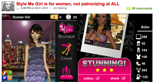
Amid the positive articles on our Style Me Girl launch from , and others, one popped up by from a very different angle:

Jim’s view as I read it was that a fashion RPG designed for girls and women playing as a stylist was patronizing. His final paragraph:
Rejoice, GURL GAMARZ, no longer will you have to play Calling Duty or Grand Auto Grab with those smelly boys. Now there is a game that you little ladies can play while you’re shopping for shoes and thinking about kissing the high school leader of the footbasket team. Aren’t you lucky?
Well before responding, to be clear I have a lot of respect for Jim and his work. He’s among the best in the business and it’s refreshing to see someone call it as they see it. Not to mention it’s way more fun to read, which is why I count myself as one of many Destructoid fans.
That said I have to respectfully disagree and respond:
- The piece mentions that we’re described as the “first mobile RPG exclusively for women.” Rather, what we did say was that it was the first 3D fashion RPG game, because we feel our 3D technology is quite unique, and that it was among the relatively few RPG games for women. And yes, there are boys and guys who play as well which is just fine by us.
- We feel female gamers should be able to enjoy different types of games including ones made specifically for them. Our new designer Moona loves World of Warcraft as well as girl games like Fashion Story. Jasmine, our marketing manager plays Crime City and D3 as well as Top Girl. Shouldn’t there be Vogues and Cosmos to complement GQs and Newsweeks? Imho, the more choice the better. Hence Me Girl.
- Finally playing a game where you are an aspiring stylist, shopping and doing photo shoots is to us, a positive thing. Fashion is fun and creative! Games are fun and creative! Both have no age limits. Why not bring the two together?
And whilst there was plenty of debate in the comments, it’s good to see others in the Destructoid community who feel the same way:

Anyway long live freedom of opinion and choice. Now it’s back to work :)

run a that makes . Life is good!
♥ Ouendan, Sims, Diablo, Noby, SF, Skyrim, Words w/ Friends, Ninja Gaiden, Nintendogs..
Say hello at or


