A couple weeks back I was invited to speak at the Mobile Game Forum event. My topic?
A summary of some interesting game design trends for retention and monetization. My full slides are below, the ten I spoke about were:
1/ the rise of idle tap clicker games
2/ auto-play and where it goes
3/ games as spectator sport - esports
4/ adaptive pricing and balancing
5/ smarter live ops tied to monetization
6/ classic genres adapted smarter to mobile
7/ extending meta gameplay
8/ subscription and VIP programs
9/ faster player feedback and art a/b testing
10/ life beyond the RPG bloodbath
For any questions or feedback -
from
When it comes to free to play design, our starts with creative freedom and then decides through quantitative feedback.
In practice what does that mean?
Lots of experiments and A/B tests. Not just for features, UI and economy - but also game art. Here are some of the tactics we use:
App Icon
An app icon is always lowest hanging fruit when it comes to increasing downloads.
We use , built into the Google Play Developer Console for this purpose.
An example with one of our 3d simulation games:

Here we tested different icon compositions trying to “beat” the prior champion. One, two or no avatars? Elements from the theme, the gameplay, or just focus on characters?
After a couple of days of data we found a single avatar and gameplay background performed best, outperforming the original icon with a high degree of confidence (it’s handy to be able to see the expected performance interval directly in the results)

In one of our older dressup games we found an icon with a “popstar feel” improved install performance over 10% relative to the original - more than we would have guessed.
Apart from icons, we also use Google Play Store Listing Experiments to A/B test other aspects - screenshots, description etc. A handy tool!
Testing Game Art
We also test game art in two main phases of development:
Testing Concepts
Early in the design cycle our designers come up with art concepts and we get feedback on style / subject matter.
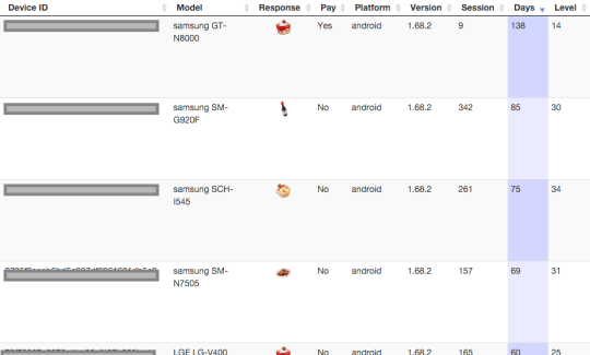
For example, in a farm prototype we wanted to add more crafting, and tested to see what players preferred to make. In this case there was a strong preference for cakes over other types of food and drinks:

In another example we wanted to see what type of items players would want to sell next in a :
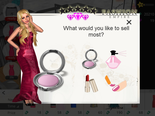
The feeling of spamming is always a concern with popups so typically we:
We use the and web dashboard for our in-game image and text surveys.
Sometimes we want to ask questions of people outside of our app’s current audience. For this we use , while more expensive, can be helpful especially when exploring a new audience type (you can setup qualifying questions, for example - do you play social casino games?)
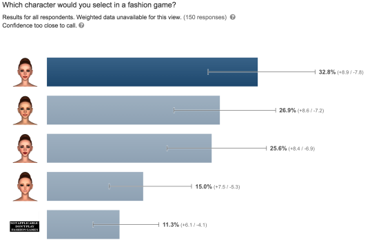
Apart from surveys we also use with hardcore fans for more traditional feedback and discussions:

Testing Produced Art
Once we have art created, we then poll the finished items. For example shoes in a fashion game:

Why? Mainly as input for balancing and content distribution.
For example an excellent first impression in NUX flow helps next day retention, so we plan for some of the highest rated items to appear up front.
We also want to make sure premium bundles and items have the most desirable content to improve conversion etc.
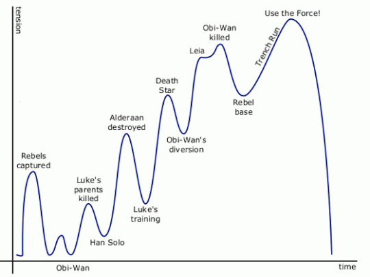
Source -
Just like the level of excitement tends to cycle up and down through a movie or game, I think a similar approach works when it comes to arranging content in a mobile 3d game.
A/B Testing Builds
Once everything is ready, we’ll often A/B test the new build itself using Google Play’s . Using this, we can decide how much of install traffic will be on a new version or the control (existing one).
If it’s a major art or feature change (for example a recent Christmas themed update during the holidays), we usually roll out 20% of our traffic and monitor over a week or more. This allows us to check at least the early retention and monetization metrics before we commit to roll it out 100%.
Conclusion
Being able to test art has had a number of benefits for our studio.
First it lets us try lots of ideas - mild and wild - at the concept phase, which is quite liberating from a creative standpoint.
Testing also lets us have confidence before we commit to production and launch, where the costs are vastly greater.
Most of all it this feedback loop helps us get closer to the most important stakeholder of all - our players!

ps - if you want to get in touch - my
How to kill the king?
It’s a question many midcore studios have struggled with.
For 3 years has stubbornly stuck to the top of the grossing charts, despite the efforts of many.

There have been the dozens of with the same basic formula - build a base, mine resources, produce armies and attack others while walling up and defending your own. There have been different themes and increasing production values, but so far no one has been able to knock Clash with its strong community, off its throne.
In fact the only pvp game to play at the top has been Game of War, which took a very different path by setting out to be the best hardcore strategy game, re-inventing a deep warfare formula that did so well for Kabam and others in prior years.
So is the only viable option in the genre to abandon casual accessibility and go hardcore?
Maybe not.
One new title, from Aegis Interactive, has gone the other way - stripping out complexity and going for mass accessibility.

As a game designer it’s a fun title to analyse.
The game eschews many “proven” mechanics and feels like a fresh take on a much-loved genre.
Let’s take a look at it’s more interesting elements:
Ditching army production
One thing a player in Gods will notice within the first few minutes is that there are no resources to mine and store, no factories to build nor build queues to produce armies.
In fact there are no armies to produce at all.
Instead, you have a small number of Gods to fight with and upgrade.

This has a number of advantages, especially for more casual players:
Ditching walls
When it comes to defense, in Gods as in other games you can build fixed structures like towers, and also fixed structures that permanently house defenses, for example archers.
They can be upgraded but don’t consume resources - they are always “full” for defenses and there is no production required - they act autonomously in your defense.
There are also no walls in Gods.
Whilst it’s fun to build up intricate defenses around storage units and towers, it’s also a big resource investment to commit to making (or upgrading a wall). Players have to spend days or weeks (or more) to finish one for a full base, during which time they feel weaknesses of their build. This of course helps a lot in monetization, but for those majority who never pay it can reduce the fun.

Instead of walls, Gods introduces houses which give proximity-based benefits to other structures, which gives fun strategy and decision making with a much lighter commitment than walls.
MOBA style attacks
With no offensive armies, attacks on other players feels more like a MOBA.
You attack with only a very small number of Gods, with full real-time control of movement, attack and special moves.
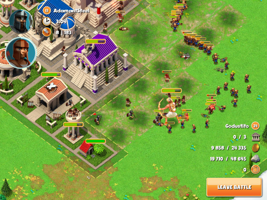
You win when you destroy all the enemy temples - your reward is the same regardless of what else is destroyed or left standing.
This has a number of benefits:
No backing out of attacks
One feature of traditional battle games is scoping enemies and deciding whether to attack or skip. This can often lead to large amount of time clouding to find an ideal target, during which time you are steadily consuming resources and getting bored. Instead, Gods lets you decide whether to face an easy, normal or hard opponent then then selects one you must attack - leaving the battle counts as a defeat.

With no armies or lasting hero health bars, there is no penalty to just giving it your best. Whist this approach can sometimes feel a unfair when you must fight overpowered enemies (matchmaking still feels rough), on the positive side it forces you to adapt to different situations and defence builds, rather than choose the ones you are more comfortable with.
This adds to the variety and the satisfaction of mastery.
Instant actions
Whereas other battle games tend to monetize in many ways including heavy use of slots and timers (see the approach to opening Gacha boxes), Gods appears to have made a conscious decision to go a different path.
It’s a happy surprise when building your first structure to have it complete instantly, with a resounding sound effect. The positive feedback loop is strong.
The single timer then that remains in the game is the slow stamina (nectar) recharge timer. ie- the freemium block:

Everything else is independent of time and by doing that the game feels “”. One good example is clearing environment structures, which is not only instant but also consumes no resources or workers, and also grants resources as result.
This approach seems to be helping - with positive reviews and high ratings, despite the main recharge timer being currently very strict - allowing 4 battles every 4 hours only (each lasting a minute or two).
Real-time guild co-op
With such a strict stamina charger, there is a lot of spare time between attacks on other bases. In Gods this is put to excellent use through a well designed live alliance system.
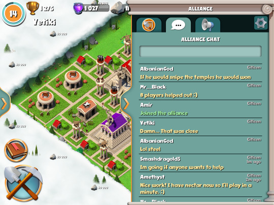
Unlike other games, right from level 1 you can instantly join an alliance and once in, you will see in real-time attacks by and on your alliance members, and even better - jump in and help:

In just seconds you are in the middle of the conflict, and can support by placing down supporting troops with cooldown - fixed troops that appear of equal strength, I think regardless of level (not sure about this).
There is no costs to the troops - they do not come out of your army or resources, they just appear and help in the defense or offense.
More than one alliance member can come to the aid in a single battle:

This system works very well in practice:
No loss from being attacked and defeated
When others attack your base and prevail, you don’t lose anything apart from some minor ranking impact. In fact if you defeated any of their heroes in your loss, you still get a minor bonus granted.
Whilst this reduces the intense revenge feeling when someone attacks in other games, in Gods this means you avoid the feeling of wanting to give up totally on coming back to a wrecked base, or feel it’s not fair when paying users take your effort away from you.
This adds up to the positive impression of the game and community.
Test attacking your own and alliance bases
Another smart feature is that Gods lets you, for much lower stamina cost and no rewards, attack your own base and test your own builds out.
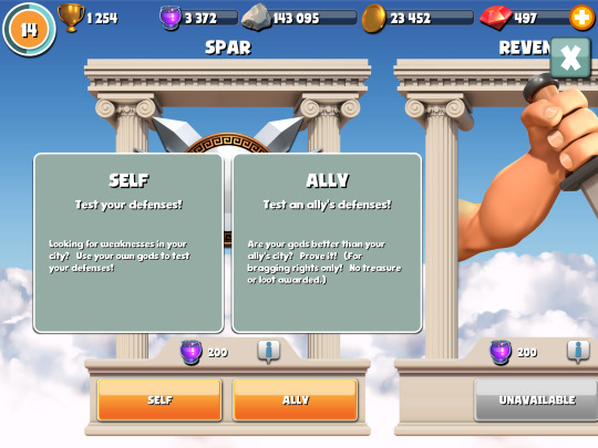
You can also do the same with alliance mates (spar) which can give a lot of entertainment and relationship building while waiting.
This provides fun additional gameplay without affecting the balancing.
Free story mode
Continuing the theme of feeling friendly, there is a free story mode that consumes no resources, and gives progressively more difficult attack and defend scenarios. If you lose, you can instantly try again.

It’s another way to ease more casual players into the gameplay and the world of tactics - you get to play with heroes apart from your own as well.
Summary
Gods of Olympus is a well designed game that has taken an interesting approach.
It has chosen to strip out many extras and focus on its core - fun and accessible real-time battles with alliance friends.
Whilst the lack of mechanics such as timers and armies might cause a lower payer LTV compared to games like Clash, I believe it gives itself a better chance to attract and retain players. This in turn would make a strong foundation to then introduce elder gameplay to its community over time.
So will it really challenge Clash? It’s too early to tell - but it’s a fresh take and I think has real potential. Now, back to playing!
ps - I don’t have any connection with Aegis, this is just my take as a game designer and player. If you want to get in touch - my

It’s been a crazy year!
Lots of projects. Late nights.
A windy path from ideas to reality…
Here’s 10 game design lessons learned this year:
1/ If in doubt, take it out.
A few months ago we had a game prototype with some half-finished features. One was a Gallery to help players savour past adventures. When push came to shove we removed it from the alpha - after much hand wringing and a tinge of guilt.
So what was the impact of the removal? Not much.
The fun factor remained almost identical without it.
We freed up cycles to improve the core gameplay, with a much better game as a result (one that still doesn’t include the Gallery… but we’re fine with that)
Early on, less is more.
2/ Context, child.
In that same project we had an item discovery mechanic we named the “Shop”. In focus group after focus group players told us they felt frustrated and confused.
At one point I questioned whether the mechanic would work, and considered a switch back to something less risky.
In the end, the fix was simple: don’t call it a “Shop” (doh!)
Once we switched the name, expectations changed and a under-performing feature turned into something fun.
3/ UI = "Ultra Important"

One stuff up this year was an RPG, an early project we had to reboot.
The mistake?
Designing a deep game that seemed fun in a GDD, but couldn’t work in an actual phone UI.
I had designed the specs on paper, our devs implemented much of the systems before reality dawned - we couldn’t fit it all on the screen without greatly confusing players.
And by that time mechanics were too heavily linked, making it much harder to remove individual parts.
Ever since, we’ve had UI mockups in lockstep with game designs and prototypes. More up front work but far less pain down the line…
4/ Don’t balance bottom up
It’s not much fun to build a fun prototype and see players blow through the content too quickly. Or discover there aren’t enough quests to fill out mid-level progression.
The big picture lets you set your anchors in days, weeks, months and years, and guides you on how much to fill in the day-to-day path.
5/ Dialogs deserve prototypes too!
Raise your hand if you had to rewrite or throw file away thousands of lines of text. Perhaps twice?
*sheepishly raises hand*
Why?
We started text “production” before we’d set the right story form and function to fit the game and UI. And in another case because the mechanics changed and made the original text redundant.
It’s much better to test a small amount of text first and then write the rest once later on, once it’s all locked in.
6/ Don’t bumble the bundle
In a recent beta we had to delay to optimize the initial download to under 50MB. This required dropping assets to later bundles and adjusting tutorial, thankfully not too bad as we have a streaming asset system, but still a last minute scramble.
And no, you can’t really “cheat” and just put overflow into an initial download on first run. We’ve seen 40%+ dropoff rates with even as small as a 30MB download after first launch.
Thinking through the initial asset budget in more detail saves headaches down the line.
7/ Plant your story in a big pot

We discovered that our first game continues to have a much longer lifespan than expected, with many players playing now for over a year.
At the time of launch, we hadn’t thought through the story expansion, and had to twist together a second act that resulted in some inconsistencies we had to iron out later (the game now is more than double the original in length)
These days we imagine a launch version is just the first part of at least a trilogy worth of content that we have thought through (at least at a high level), to make sure we have plenty of space for expansion.
8/ Programmatic trumps manual balancing
Well strictly speaking, that’s not always true.
There are always some parameters better hand crafted, particularly in the NUX.
But as a game designer you only have so much time in the day, and you can’t spend them hand crafting prices for thousands of items, or manually pick rewards for hundreds of levels.
We switched the bulk of balancing for new projects to formula bases.
A bit of extra work up front for the coders now results in many benefits:
- much faster tweaking of difficulty and progression
- lets us goal seek the parameters to meet overall balancing goals
- enables us to run much easier A/B experiments
- more sleep
9/ Polish can wait.
Similar to premature production of text, creating near polished UIs and icons for a system that ultimately had to be changed…
I find now it’s much better to stick generic all the way through the prototyping and alpha, and then start real art production and polish at the last step.
This has had an extra benefit of helping concentrate on core gameplay early on, rather than what shade of purple to use for that Settings icon.
If a temporary “wireframe” UI can house a fun game, it’s a great sign for later when the real art and polish is added.
10/ New location for new inspiration

It’s funny how a change of environment, even for a few hours can spur new thinking.
Exotic subreddits, watching TED talks or reading books are fine, but there’s something fresh about time away from the office.
One of our new game designs was conceived during a weekend startup hackathon, in a big theatre amongst lots of great startup energy.
Another idea I’m in love with came from chatting to some young hippies in San Francisco (yes, the world deserves a basket-weaving game!***)
Summary
Like most endeavours in life, learning to make great games is a journey, and the wins but also missteps have lots to teach.
Thank you 2013, you’ve been great.
What lessons do you have? or , would love to hear.
*** well not that idea, though it could be pretty fun….
Let’s imagine games as people.
We’d think of attributes - brash or quiet, strict or forgiving, quirky or dry, daring or safe etc…

As game designers - what traits do we want for our game?
Well, people tend to gravitate towards and , and . Makes sense, and there are plenty more on the list (1)
How about empathy?
In relationships, people (2) tend to value those who are thoughtful and make an effort to consider their point of view.
Let’s call it a game that’s “on your side”.
It could be reflected in the core design and UI, and also in various small and simple features that signal the game’s looking out for them.
Some nice examples -
In by Machine Zone, the free speedup option let’s players shortcut timers when they fall under a 5 minute threshold:

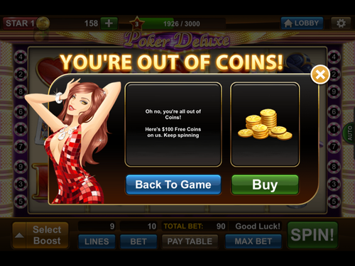
In by IGG, when you first run out of coins you’re given extra for free to keep playing:
In Zynga’s , hero quests don’t consume the items they request, allowing you to sell them after:

The birthday gift in Supercell’s feels thoughtful and personal -
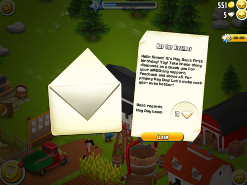
So are these games at their heart, altruistic?
Not at all (3). Let’s not forget they are still free to play games that do a great job of extracting revenue from paying users, as they should.
But they do a good job of signalling they care for the players, and in the process help build attraction and loyalty.
Notes
(1) beyond the universal ones, player taste and personality matters a lot
(2) this particularly applies to
(3) as any free player struggling with storage limits and ingredient production times in Castleville’s mid game would tell you
Other great examples? I’d love to hear - or .
It was fun to talk about live operations, specifically time limited* content and mechanics, at this year’s .
I’ve uploaded my slides here, which cover:
* new levels and missions etc also falls under the topic of live ops but the slides focussed in on time limited content.
The talk itself was only 20 minutes which was a shame as it’s a fascinating topic and lots of interesting things to go into (eg- pros and cons of different contest mechanics etc)
Any great examples of live ops out there? Share on or
New iOS, new App Store…
If you’re like me, it’s time for optimism with a touch of dread. Are the changes better or worse for my apps? My players?
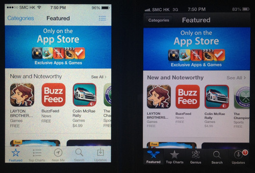
Recently checked out the Appstore in iOS 7 vs iOS 6. Overall it’s a step forward and imho mostly positive for devs. Here are the side-by-side iPhone screenshots. Recommendations at the end.
Featured Page
Top Charts

Category navigation

Subcategories - eg Role Playing

Near Me vs Genius

Search

Screenshots

App Main Page

Reviews Page

Related Page

My take
ps- big thanks to ‘er Jer for pulling this together!
Your thoughts? Have I missed something? Share on or

E3 was manic.
A whirlwind of next gen consoles and triple A titles.
This year I roamed the show floor trying out as many games as possible.
Most were bigger & badder takes on familiar genres.
on Xbox One was stunning. ’s animations flowed better than ever. had gunplay, underwater! Ubisoft’s pulled us into an immersive wired city. Oh and mechs are !
So what about non core games?
Not that many.
With a of most of the industry remains focussed on its male core gamer demographic.
There were bright spots though - 5 personal highlights:
1/ That Dragon, Cancer
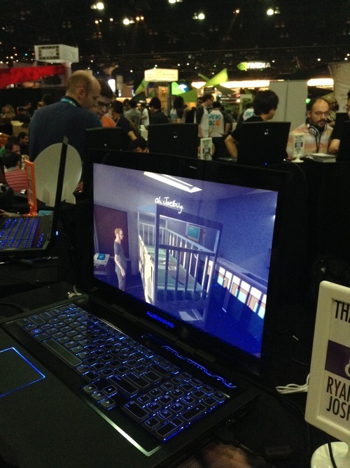
Not so much a game as a thoughtful piece of art. The setting is a sad hospital room, the character a cancer patient and his thoughts. This had the most emotional impact, despite the lack of fancy graphics.
2/ Project Spark
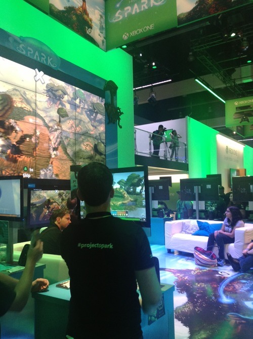
Little Big Planet and Minecraft just had a love child…
This was the most awe inspiring demo at the event. Microsoft’s ambitious game creation is a joy to play with: the first time you swipe your finger and literally create worlds of ice and forests before your eyes takes your breath away.
3/ Octodad
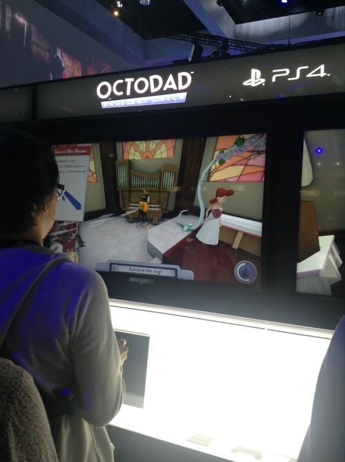
Octodad is so ridiculous in its premise it can’t help but bring out the smiles. Trying to control Octodad’s clumsy tentatcle to retrieve a wedding ring for your (female) bride is a farce, in a good way. The game bursts with personality and character, a welcome contrast to all the high speed action and violence in the rest of the PS4 zone.
4/ Contrast
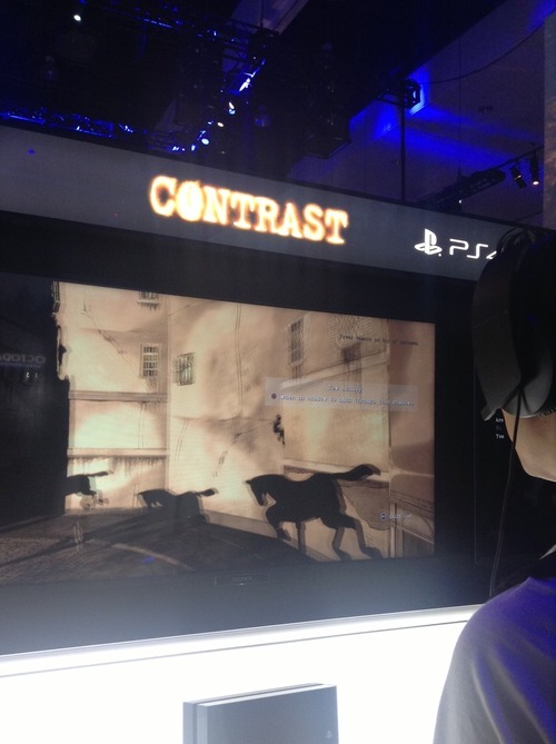
This action leaves a dark impression. Contrast has intriguing female leads, gorgeous french noir art and a gameplay twist. When your character’s shadow is on a surface you can change modes and control your shadow in 2d, moving and jumping amongst other shadows. Whilst frustrating in its controls it pushes the boundaries in creative gameplay.
5/ My School
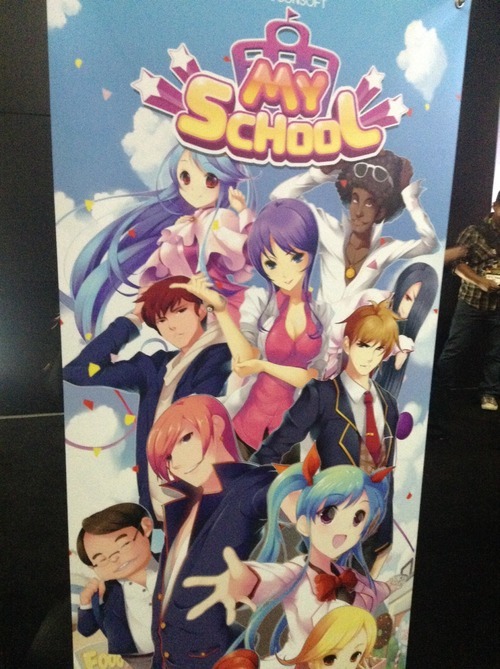
Not sure whether I’d call this a highlight or not, but worth a mention. This over the top school simulation game features plenty of “only in Asia” quirkiness (maybe fitting from a studio called Racoonsoft). Busty teachers, an overabundance of cola machines and confused students looking for work, this game had it. When I asked the goal of the game, I was told it was “to make money”.
Education these days :)
ps - special mention to - who knew 101 character multiplayer chaos could be so much fun…
What were your E3 highlights? or let me know on
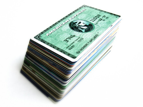
New bootstrapped startup?
Building a new app?
Ready your credit card.
Back of the envelope costs
Based on
Conclusions
Footnote
Question - is there a cheaper way?
What’s your take? or let me know on

Edit: HN discussion on this post
Lately I’ve been designing a couple new games and got me thinking back to virtual worlds.
Remember when they were the next big thing?
Millions of us tried them. Gartner 80% of all net users would have Second Life avatars. VCs invested . Even Google a piece.
My startup too. launched the first browser 3d UGC world with cool tech we built on Unity. You could chat, create, shop and more.
But after a couple years we’d only gained 600k users so decided to pivot to mobile .
Here are 5 reasons why virtual worlds never took off and some ideas for how they can live on in new games:
So what’s new?
So for those of us creating mobile games, should we forget about virtual worlds?
I don’t think so. Whilst never living up to its hype*, we can continue to incorporate their positives in a deeper way.
First is to figure out how to tie greater creativity into our mechanics to broaden .
This can be really tricky - how do you “judge” creativity in a programmatic manner? Easier if it’s creativity to meet a certain functional goal (ala Bad Piggies), but is there a way to judge “beauty” or “artistic merit”? In our first game we built a system to judge a fashion outfit. Whilst sufficient I’d be first to admit there is a lot more nuance that could be added, though it’s not always easy to define and balance such a system.
If judging is community based how to you build systems to make it fair, tamper proof and not feel like work? And do it in a way that’s timely, and gets the core loop running quickly?
We could also do more to foster friendships between players that last years, not days. Ability to collaboratively work on shared projects is something extremely meaningful in virtual worlds. Guilds in some mobile strategy games let you coordinate attacks which is lots of fun, but haven’t seen much yet in the way of coop base building, or crafting etc.
We can offer a deeper level of customization, allowing you to tweak not only your look but your personality and how you engage in the game world. Chat and status messages are a start, but could you have ways to customise how your characters or army or base react programmatically under different circumstances (like scripting in SL but without the complexity).
Not all virtual world concepts translate well, and getting them working with a simple UX for a small screen is the challenge, but there are things we can learn from and adapt.
What’s your take? or let me know on
*Whilst not a mainstream success, virtual worlds are still active amongst several niche groups, eg deep roleplayers, virtual artists, or the disabled - where they can move, express and socialize in a way they can’t in real life.

There’s an interesting trend bubbling up of extremely time limited offers in mobile games - let’s call them microsales.
In a microsale, there’s an offer - for example a deal on a virtual item, currency or content (eg- access to a special dungeon). This is presented with a very short countdown timer, typically 20 seconds or less.
The player is forced to make an explicit decision on the spot - take the offer now or let it pass with regret and uncertainty as to when or if it would return.
It’s an interesting entry in the monetization toolbox, and one that to me, makes sense:
A by Scott Swain, Richard Hanna and Lisa Abendroth (2006) examined 3 mechanisms (deal evaluations, anticipated regret, and urgency) that influence purchase intent, through the lens of time limited sales. They concluded:
…shorter time limits create a greater sense of urgency thereby leading to higher purchase intentions…giving consumers more time leads only to more delay and, in effect, the shorter time limit causes the promotion to gain priority on consumers’ “to do” lists. However, caution is needed since… too short of a time limit can also increase perceptions of inconvenience, leading to lower deal evaluations and ultimately lower purchase intent.
On mobile the “inconvenience” factor I think is reduced - you’re already in a “limited time” frame of mind, and all it takes is a single tap on a button to take up the offer - especially when using virtual currency, not needing the interruption of IAP password entry.
That out of the way, all you need is a sufficient time for the deal to be evaluated, which is normally in the period of seconds, not minutes.
Does that mean traditional 24 and 48 hour digital sales are on their way out? I doubt it, but I suspect that we’ll see a lot more of microsales used in parallel in the future.
Have you used or seen a microsale lately? Would love your feedback. or

In the first social game wave, two common mechanics were harvest (appointment) and its companion, wither (delay penalty).
Playing off the harvest, the wither helped reinforce the regular return cycles those games were designed around. How?
The fear of loss can be strong. The feeling that your precious crops would decay (or be ) was a strong motivation to log on that one last time before sleep or early morning before packing lunch for the kids.
Fast forward two years later, the wither mechanic seems to be falling out of favor.
This year’s most successful mobile farming sim, eschews it.

So do many others that have ranked in recent times. Even Zynga’s team at GDC talked about how they wanted to remove it, but were constrained due to other factors.
So why this trend? Some thoughts…
This type of system gives the player a warm feeling, one that the game is on your side.
Update - a great comment on the article by Nick Bhardwaj brought up Clash Of Clans having a subtle wither mechanic with troops, which need time to be produced but can be lost via PvP. Personally I’d describe this as a core PvP loop rather than wither - there is no way to securely “bank” your troops for use later (shield is something separate), and there is also no attacking done by the game itself, just other players. Fear of loss and the need to revenge are very strong drivers in all online battle games. His take was that Supercell encourages you to return and immediately “spend” your troops, which is more positive than the environment taking them away ie- its a more upbeat multiplayer twist on an established mechanic. Interesting discussion.
Does wither still have a place? Love your feedback: or

Quick one -
I’ll be spending the full 5 days at GDC next week.
If you’re coming and would like to catch up do ping me at
See you pirates there…
Simon

I took the train a few times last weekend, and on every trip I saw people playing both and Puzzles & Dragons.
Both are very different in style and mechanics, but at their core they’re both puzzle games.
If we look beyond mobile, millions still play Sudoku, despite the “fad” being close to 10 years old. And countless millions more enjoy filling out the daily crossword puzzle (yes, newspapers still exist).
Why?
Studies have shown the release of dopamine associated with solving a puzzle - the aha moment - clearly there's pleasure in puzzles.
Humans only?
A fascinating new shows how ingrained into our evolutionary makeup this behaviour is.

Research by the Zoological Society of London using a game designed with dice, pipes and holes found that chimpanzees are motivated to complete puzzles even in the absence of external rewards.
“We noticed that the chimps were keen to complete the puzzle regardless of whether or not they received a food reward. This strongly suggests they get similar feelings of satisfaction to humans who often complete brain games for a feel-good rewar.”
- Fay Clark, ZSL researcher
The fun of solving puzzles appears to be wired deep.
Double the pleasure?
So does the pleasure come just on completion of the task? And does it only flow in one direction?
Other has shown the that being in a playful state can help solve puzzles more easily, and interestingly, anticipating solving a puzzle puts the brain into a more open and pleasurable state.
So in addition to the satisfaction of finding a solution to a difficult level in CCS, there is also the sweet anticipation as you start loading up the game and prepare to play.
What does it mean for game designers?
So does that mean we should drop our space battle, shooters or farm games and all switch to Match-3 puzzlers?
No, not really.
But some takeaways I’m thinking about:
What’s your take on puzzle games? I’d love to hear: or
Note - this was a guest for TechInAsia, a great site for APAC startups.

If you’re doing a startup, there’s allure to a big brand partnership.
You might think: close a deal in a couple months and then prestige, validation, press, growth, new opportunities etc…
“If I get this deal we’ll be up in the bright lights!!”
Except it doesn’t usually work that way.
The reality is more like:
Our success and failure
My startup has worked with a few large brands in the past year. One failed draining precious cycles. A couple though turned much better, including a successful collaboration with media giant on new game , launched after months of hard work.
Here are some 8 startup lessons learned:
Lesson #1 - Press is overrated.
If your main goal is “buzz” that will lead to more downloads / users / revenue for your startup, brace for disappointment.

Even a mention in major media such as Tech Crunch translates to only a temporary spike (we’ve seen this). A friend got a top tier celeb to promote his new startup, resulting in far less returning users than he hoped.
We all remember glitzy press launches for projects that end up failing a year later. And those that rose to success without PR. Our new game got only a of editorial pieces but has still grown well despite it.
Whilst press can help for other reasons (eg- fundraising), a partnership is a pretty risky and resource grabbing way to try and achieve those goals.
Press is icing on the cake, rather than the cake itself.
Think about press as a great bonus only - if you don’t get it, no worries, a solid project will still thrive without it.
Lesson #2 - Is your opportunity cost acceptable?

Doing any project with a Fortune 500 company is going to take more time than you expected. Much more time.
Our project took nearly 6 months to deliver, and that’s fast.
Big brands need multiple approvals with different stakeholders, reviews with marketing and legal, endless back and forwards on product etc
If you’re a small startup and think you can create a brand new app for a brand whilst maintaining momentum on your “main” business, think again.
You’ll need to either hire up, rework what you already have, or try to turn your tech into a platform…or accept that THIS is your startup, and that your prior project will have to wait, perhaps forever.
Our project that failed in the end turned out as a good thing for us -whilst famous and adored brand to be associated with, it was turning into a large departure from our existing path (high opportunity cost) without enough strategic benefit.
Lesson #3 - Work with the right advocates

In a big company, it can be easy to find groups who may be interested and engage you in promising discussions that end up stalling.
Before committing lots of time with a group, some good questions to ask:
In our case, we found an innovation products group who had a track record of projects and getting buy in from the different Conde Nast brands, and brands willing to embrace a new project - which got it all started.
Lesson #4 - Define your scope up front

Whilst in lean startup land we work iteratively and adapt, doing this with a brand that changes scope every week is a recipe for chaos at the least.
Small innocent requests - “oh can we add a module to let the customer redeem coupons through the website as well as the app?” can snowball.
Though there are pros and cons, I think it’s better to agree a list of deliverables and put it in writing early.
But how do you get it “right” from the start?
A good way is to either adapt from something that is proven to work (we based the new game on a mechanic from our first game) or do the upfront customer development and planning work to make sure it has as high chance as possible at success.
It’s a tricky one.
Lesson #5 - Harness the supertanker.

Big companies have processes, legacy and move slowly.
Startups are lightweight speedboats, deciding and moving quickly.
So what gives?
The natural instinct may be to try and bend the big company to your way and pace of working. This will lead most likely to frustration. Yours.
Instead, adapt to their way of working and get the big supertanker pointed in the right direction and let it power through.
For example all our normal task planning is through Google Docs. On the other hand, our partner did planning through Excel spreadsheets and a project management system. After a while, we just ran with it, and made sure that ALL the things to make the project succesful were included.
Once they were “locked in” the system, they just got carried through their usual process and happenes. If you focus less on the “how” and more on the “what” you can make the big company ultimately work for you.
Lesson #6 - Get the term sheet in place early

Legal contracts are one of the least enjoyable things a startup CEO has to deal with (after emptying trash and 4am server down emergencies).
Crawling through pages of minutia to spot potentially lethal gotchas doesn’t help you make your app even better.
And you may, like me, suck at it!
I’ve found a couple of ways to lessen the pain:
Lesson #7 - Secure a budget.

Startups think burnrate, but big companies think budgets and headcount.
Are they going to contribute marketing to the project? Then what budget will be spent, by whom and where?
Are they going to be doing part of the work on the project? Then who is allocated and for what percent of their time?
Ensure your project has resources allocated and if not, ask nicely for it. If they are not sure, then request a good number and discuss from there.
Having these in place rather than a “best effort” will increase the chance of making it a success.
Lesson #8 - Does your head and heart align?
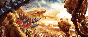
Back when we were still doing virtual worlds, we did a collaboration with Weta. As a big fan of Lord of the Rings & King Kong etc I loved this deal!
We would collaborate on a contest to promote their steampunk sci fi brand. The problem? Our audience, mainly women, weren’t into that genre. Despite it being well executed, it didn’t either make our service more sticky nor drum up more buzz for their brand.
The lesson? At the end of the day, only go ahead with a partnership if it really makes sense at both emotional and business level.
If head and heart line up, chances are it’s worth to pursue. Good luck!
What’s been your experience? I’d love to hear: or
Progress with friends
Count me as a fan of Candy Crush Saga on .

The folks at do a great job. Much fun is the over the top (and slightly creepy) presentation of a much-loved tile matching mechanic. But I also love the transition between levels on the Candyland map and being able to see my progress vs Facebook friends:

Woohoo level 10… see ya Mike…

Um… Charles, Angus, Sana and Mary, you guys have too much time on your hands *_*
Air’s thin up there
Seeing your Facebook friends* in a game can be a strong motivation to continue on the grind of a game.
* For many hardcore players who use dedicated Facebook game accounts with non irl friends, I think the argument still holds. You often have as strong a bond with them through other games spanning many years of your life
But it’s increasingly the case that:
This presents a question to game designers who spend many cycles on high level systems and players, those who bring in the big revenue.
On one hand you could argue that the real friend social layer is only needed to get you addicted to the game and helping the viral coefficient a bit, and once you’re up there at high levels the meta game and game-specific social components (friends, guilds, challenges, events etc) take over.
But to me it seems strange to have two separate friend layers within a game - Facebook and in-game, often used in different parts of the UX and game systems.
A marathon model?
Imagine in a game like Candy Crush Saga if that instead of showing a ever thinning list of FB friends as you progress up through the levels, you blend in-game friends (and foes and strangers) into the progress map.
It could be done programmatically.
A sprinkling of high level players, with serious bling showing the spoils of progress, as well as those with a similar cohort, trajectory or level to yours, to encourage you to keep on moving (analogous to how Clash of Clans throws high level players occasionally into the random PvP matching as well as those ranked similarly in level to you)
The way I see it, this model could be like a marathon:

All of these three groups are different, but aren’t they all runners in the same game?
Should FB and in-game be treated the same? I’d love your feedback. or .
Recently we bid farewell to a new feature…
It was a cute feature, one we liked. But at our morning metrics meet we made the grim call. When the daily Android build went out hours later, it was gone.

Sunsetting a feature - how to decide?
“Stella’s Assistant” was designed as a basic plant & harvest currency mechanic. Players would start a job from 5 minutes to a day, and get paid once done.
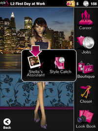
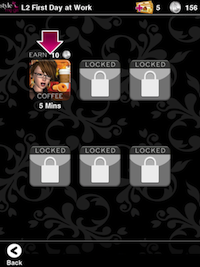
It was a small feature, an MVP hacked together on an assumption it would increase retention, helping remind players to return to collect their coins from Stella.
Other retention features we had launched performed well. Yet after launching it to our usual A/B test we found retention actually decreased in the group that had Stella’s Assistant, vs the control:
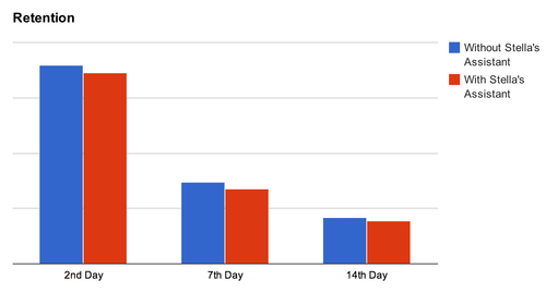
And to top it off, monetization also dipped:

We first verified the test was statistically significant. Next we thought it might have something to do with economy balance and tried with different payout values. Yet in no A/B test was the result positive.
Should I stay or should I go? Some tips to decide
When a feature under-performs like this, there’s a binary decision to make: iterate it or drop it.
How do you decide? Some questions to consider…
Is the feature meeting its stated goal?
It’s good to have a goal for each feature, preferably a specific number. eg- lift 7 day retention by 5%. Then when you release it you can see clearly whether it was successful.
In our case, the answer was no. The numbers don’t lie and for a feature designed to improve retention, to have it dip down, albeit slightly was pretty damning.
What is the underlying reason for its under-perfomance?
Often, numbers tell the what, but not the why.
In talking with players we found Stella’s Assistant just didn’t add much to the game. Whilst extra coins were nice, it felt like a weird farming sim feature tacked on to a fashion game. It also made the UI busier, and introduced an extra menu layer and more taps, pulling the overall experience down.
What is the opportunity cost of iterating?
As a startup, every developer hour counts, and the question is whether trying to improve the feature would have a bigger impact on metrics vs using that time to develop something else.
Apart from metrics impact, you have to weigh up the ongoing additional cost of testing and support.
In this case we weren’t convinced iterating it would move the needle much, and we had several other features that would have a much better “bang for buck”.
Does it have strategic value beyond metrics?
Some features may not improve the numbers, but may still have strategic value.
For example, a device registration system to stop cheating, an icon promoting a partner, or a parental safety feature that stops inadvertent payments in a kids game and builds long term trust.
In our case though, there just just wasn’t one.
Final tip - stay positive!

Abandoning something you have worked hard on, whether for a few hours or a few weeks is never fun. Us humans deal pretty badly when it comes to loss, including that at our own hands.
The key though is to stay positive, and realize you may have lost a feature but you gained a real learning - one that can only improve you and your startup going forward.
So, Stella’s Assistant rides the slow boat to Valinor and for us, the adventure continues :)
How do you decide when to kill a feature? I’d love your feedback. or .
For a startup game company, does brand matter?
A while back I sought wisdom from a group of experienced tech entrepreneurs, all of whom had built successful companies:

That makes sense.
Why build a brand?
In an age of and cluttered app stores, having a strong brand for your portfolio is more important than ever.
Increased brand equity to increased customer lifetime values.
A strong brand will convert better in cross promotion and organic adoption of apps from the same company, offsetting rising CPAs to individual titles. A friend at a large mobile studio with many games, estimated the brand uplift factor to be over 20%.
And basic brand building doesn’t cost that much, making it startup friendly.
Yet why is branding is usually the last thing on our minds?
6 months ago I would have counted myself in the “product is the ONLY thing that matters” camp, yet now I’ve switched camps…

These may be great games, but would players know these are from the same company?

On the other hand, how could a player who enjoyed Tap Paradise Cove and loves cute animals NOT want to play Tap Pet Shop?
How to do it?
Ok, so it’s important, but for us engineers or designers, where to start?
Having gone through the process with , I found working through these 5 questions was very helpful:
Let’s go through them one by one:
1. Who is the target player & market?
Yes, the easiest one! You’re making a game, you should have a primary audience in mind. eg-

What if you believe you’re making the next Angry Birds, a game that will be popular with literally everyone?
Creating a game like this is difficult. While you might strike it lucky, your chances for success and monetization go up if you create games designed and branded for a target group of players. Even mega hits like Temple Run and Words with Friends have their primary markets (teens and adult women).
Defining player personas, who you’re building for, lets you really dig in and understand:
2. What are your core brand attributes?
If you had to pick (and you do!) what are the 2 or 3 things that are unique to your brand. Put another way, what makes you different from everyone else out there?
Let’s look at some examples from mainstream:


Once you have gone through this and settled on your brand attributes, it’s like you’ve found your North Star. It will help guide you in decisions from here on out.
3. What does your brand stand for? (emotional connection)
The strongest brands form emotional connections with consumers that often override logic and reason.
Low cost rubber and fabric stitched in a factory in Indonesia can inspire people to “Just Do It”. People will queue for days for the latest iDevice. Overpriced headphones from Beats convey urban cool and freedom from authority:

It opened our eyes - when we A/B tested taglines for Me Girl, we found emotional phrases like our final choice “Fabulously Me” converted much better than impersonal choices like “Games with Style”.
“Fabulously Me” sums our mission: to make women feel fabulous while playing our games. Regardless of age, looks, body shape, status in life, challenges…everything.
This is what our brand stand for.
If a brand stands for something - Freedom. Challenging yourself etc., chances are players will care that much more in return.
4. What will identify your brand to players?
Once you’ve locked down your targets, brand attributes and emotional connection, it’s time to bring that to life visually.
Creating a match of logo, typography, color palette, audio, UI elements and animations in a cohesive experience that conveys your values is the goal. Honestly, it’s easier said than done (we have a ways to go) But we just consciously going through the process will often result in something good.
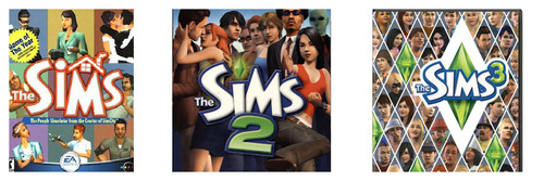
The venerable line and their “Play with Life” proposition does it extremely well, with consistent visual elements that a random 20-something on a street could identify in a second. And their music and audio right including their quirky Simlish reinforces a unique personality.
As we’ve seen with the Sims, branding elements that anticipate and can weave into future games, expansions and sequels is also important. Even more so in the age of mobile with more releases more often.
For us a future “Dance Me Girl” or “Me Girl Dancer” would fit nicely into the same family from a cross promotion perspective.

5. What games and features strengthen the brand?
Consistency is key - whether in art, storyline, mechanics, humour etc.
If decided to sell your personal info to shady direct marketers, how would you feel?

Likewise if you’re someone who enjoys Bubblez on and returned to find them pushing a hardcore dungeon raiding MMO, you’d probably be confused.
These are extreme examples of course, but there are plenty of choices that we all face every day:
Knowing your brand values often helps in these questions - ringing an warning bell when you’re heading down a wrong path.
For example we could add competitive systems where you systematically tear down the reputation of others. Whilst “fun” from a game design perspective and helping short term numbers, it wouldn’t align with our “positive and inspirational” feel.
And on the flip side, carving out cycles to do brand building features that might not directly boost metrics but help players fall in love with your game brand can be worthwhile.
An ongoing endeavour
As we’re understanding, it’s not a one time activity - building a brand is an ongoing sustained effort that spans from game design, to engineering to marketing and even customer support.
Of course a great brand can’t rescue a bad game and it’s always a tough call to put precious cycles into something you haven’t before.
But assuming you are making good games, investing in brand building can add up to huge wins in the long term.
Any branding tips to share? I’d love to hear your feedback. or
Big thanks to our investor whose Mattel experience made us “see the light”!

Think it’s hard finding engineers?
Try finding a for a startup that makes mobile games for women.
Your wishlist might look something like this…
Needle in the haystack enough?
After a couple months searching, we interviewed several talented artists, but few with the other elements. Great people for building out the team but not the lead creative role.
Always “so close, yet so far”.
Yet in the end we managed to find someone who brought all the pieces together.
Fashion design, deep love of games (everything from Star Wars Galaxies to Mall World). A third culture kid (fellow Eurasian!) who draws inspiration from the US, Europe and Asia.
The funny thing was, she turned out to be one of our original fans. On our web 3d world Frenzoo.com, she created a popular vfashion boutique under the Sheeana avatar name. She knew our project from the start, and kept up we pivoted from web to mobile.
We ultimately found the candidate with the best experience and passion for our project was one of our players.
Learning: occasionally the best talent is right in front of you, if you only look
Have you had success hiring one of your players? or
Image for a minute, one of the U.S.’s Top Grossing iOS apps.
A freemium game that has stayed top of the charts for the last three months.
Like me, you might imagine a title with gorgeous HD graphics, slick UI and a lush soundtrack?
You’d be mistaken.
In fact, the first time you play by Japanese developer (published by ), you might think you’ve downloaded another app by accident.

The visuals? Mangalicious, but low def only.
The UI? A web port with text, links, buttons and banners on often long scrolling pages.
Audio? This game doesn’t have any. Really.
But that doesn’t hold it back.
Rage of Bahamut (RoB) is a triumph of game mechanics over glamour.
It’s million dollar proof that depth counts (that should make us game designers happy :)

Up at the top of the ranks since launch
Here’s my attempt on breaking down some of the key elements that make it such a monetization monster.
Mobile-Friendly Core Game Loop
First the bread and butter.
RoB is a collectible card game (CCG) with a very solid core game loop:


It’s a simple to grasp concept that let’s players get right onto an addictive levelling grind in the pursuit of making progress.
Being a numbers heavy game (no actual combat or real time skill involved), there is plenty of depth for stats obsessed gamers to dive into.
By it’s nature it fits well for mobile gameplay.

The game:
It’s a foundation that sets it up solidly for all the monetization* elements we’ll go into next.
* RoB also has a bunch of well executed retention and viral features (can I interest you in my referral code?) but that’s out of scope for this post.
IAP removed time restrictions
Ok, like all modern social games, RoB restricts how long you can play in a session, a limit that can be removed via IAP:

This is implemented through two main mechanisms - Stamina (used for progressing in pve quests) and Attack Power (used for pve boss battles and in pvp).
Both are consumed through actions, and regenerate at a rate of 1 per minute.
Both can also be refilled through hard currency (rage medal) acquired consumables: “cure water” and “holy power” respectively.
This basic mechanism motivates players to spend to reduce waiting times, and helps pace the game for free users.
Gacha and collection mechanics
Next, the gacha.
There are several types and many hundreds of cards in RoB, each with different attributes and maturation and evolution states.
All active players have a drive to gain better cards be it through gameplay, trading or card pack purchas - a key monetization driver.
Players can purchase card packs in the prominent position on the right of the UI header bar:

A card pack (there are several kinds) contains a set number of random cards, and there is always the small chance to get rarer (more powerful) items.
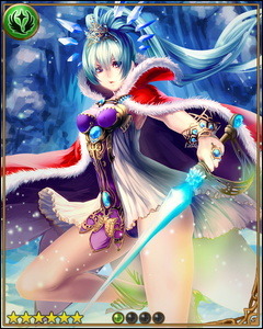
For example, there is a small chance that an SS Rare card like the Crystal Queen above may drop in a beginner legend card pack. There are at least 8 levels of rarity in the game (including normal).
And even if poor cards are received, they can at least be sacrificed to help upgrade other cards, reducing the psychological sting of drawing a bad set (more on that later).
All up it’s a solid casino mechanic that plays on the notion that you might well “strike it rich” in your next Card Pack. And it doesn’t hurt that Card Packs cost quite a lot of real money.
On a related note there are also collection drivers within the game, with bonuses awarded in case of a set completion.
One example -
In questing and pvp (you can target specific items from opponents) there is the chance to obtain an item from one of the treasure sets, which when complete give you a completion reward. This also carries over to events, where set completion unlocks bonus items.

Collecting of cards is also popular, as a result of the next topic…
Deep upgrading system
RoB includes a couple of systems, commonly used in conjunction that encourage you to source and consume cards to help make other cards incrementally stronger.
This has the net effect of encouraging more gameplay and monetization sinked through the card upgrade system, that plays into the desire to make good cards “that much better”.
The first- enhancing is a way to upgrade a cards level and battle stats (attack and defence) by sacrificing other cards, called feeders.
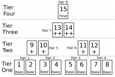
The second- evolving is a way to combine two cards of the same type to a more powerful version of the card - there are normally 4 evolution levels, and at the final level the cards rarity also goes up one level. The 4 levels are represented visually by different graphic versions of the same character, as in this Archangel example:

Like an an RPGs recipe and crafting system, these systems can be used in a variety of interesting combinations, yielding different results.
The systems also operate on a “law of diminishing returns”.
Cards have maximum rating, and increases towards a maximum require a greatly increasing amount of resources.
A maximum card evolution with only a few enhancements might deliver close to 98% of maximum, but to squeeze the last couple of percent up to 100% could take an enhancement investment of 15 (ie all cards enhanced in the evolution process).
Perfect for perfectionists :)
An analogy might be world class athletes, competing and training more and using increasingly advanced technology to shave off ever decreasing milliseconds off world records.
This makes it an awesome sink especially for its target audience, and combined with PvP participants competitive natures a strong monetization driver.
Well executed tutorial
Despite cheesy lines and endless tapping, the tutorial is strangely endearing, and more importantly introduces the player early to the key monetization systems - gacha, card packs, card upgrade and PvP, via a simulation with the guide npc.

Also subtle, the realm choice at the start of the tutorial uses your personal preference to drive the first sense of alliance and community. I’d say it represents the first emotional investment in the game, and players are generally more receptive to pay if they are hooked in emotionally.
PvP - revenge, proactive revenge and competitive spirit
Like other top grossing games (think Kingdoms of Camelot or Backyard Monsters), PvP goes deep and is a key part of RoB’s success.
Players can battle each other (your attack strength vs their defence strength modulated by various skills/effects) and by winning, gain among other things, currency (a percent of the losers liquid amount up to a certain value) and treasure.
Whilst there is some protection mechanisms so that lower level players don’t get beaten down by much higher level players, beyond that you have the chance to attack and be attacked, with impact.
This encourages players to spend to money to increase their attack and defence scores.

PvP can also get personal - there is a strong human reaction (dust off the evolutionary psychology theory) to a loss inflicted by another, even more than a positive emotional impact gaining something. Rivalry and in the evolutionary context, putting a wayward tribe member back in place I believe motivates even more monetary investment.
Feeding from that fear of loss, the game also lets you buy insurance (proactive revenge) for your treasure items (currency can be indirectly protected in other ways). The game lets you buy a magic circle to place on your treasure items. A magic circle fires once when that item is targeted by another player, automatically inflicting a loss on them.
Beyond the direct PvP battle system there is also a meta game available for players over level 10 (where some of the deeper monetization systems kick in), with a leaderboard of battle rankings, compiled using another attribute gained in proactive and defensive PvP. This is used to determine the best players during that time period, and based on their placement they are granted another currency, gems, that can be then redeemed for items and even more powerful cards.
Battle leaderboards are reset regularly, encouraging ongoing level of competition and investment in the game.
Guilds and guild PvP
Continuing on the PvP theme, one area RoB has done particularly well is their implementations of guilds, or in their terminology, “Orders”.
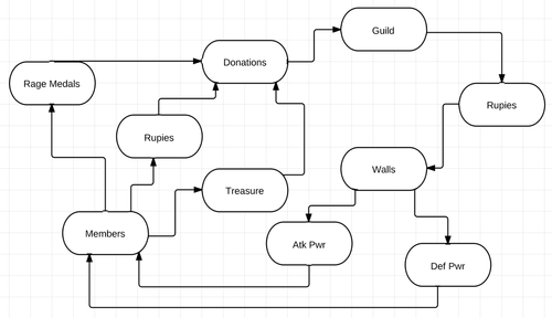
Only available to more established players (level requirement), orders let players join and then ultimately form their own groups, complete with leadership, roles and hierarchy.
Orders enable encourage investment in a group via a donations mechanism, and the leadership can also construct speciality walls and buildings that confer attribute bonuses to all members.
For example, a church constructed by an order can boost all God realm cards attack and defence by 5%, for a cost of 3 million Rupies.

Like players and their cards, orders themselves can be leveled up through group donations which has the impact of increasing the maximum number of members up beyond 30, which is useful in guild PvP.
Guild PvP is implemented through a “Holy War” system, whereby an order declares war during a set time period, and is matched automatically with another order (I didn’t figure out that algorithm), triggering a time limited event where order members battle each other, with resulting rankings (tabulated by a guild PvP specific attribute, Holy War Points) that ultimately translate into more cards.
The guild structure and guild PvP system in RoB have several benefits to monetization:
Note - In addition to the order guild system, there is also a personal group system (everyone gets a guild!) called Fellows. I won’t go into that in this post as I understand it as more of a viral/sticky tool rather than directly monetization related, but indirectly helps monetization through mechanics where fellows leader cards can assist in certain attacks. ie- we upgrade and can help each other in a reciprocal manner.
Ongoing events
Events are key - keeping the game evergreen and encourage returning play and introducing new goals to drive towards.

In a recent event, players were encouraged to stop evil entities from using magic moon tears
In addition to guild PvP events (Holy Wars) there are also PvE events that encourage team work, and encourage purchase towards event specific cards which help in the specific event they appear in.
The loop is obvious and direct but appears to works, especially when caught up in the thrill of the shared event (would be interesting to see if an indirect system would have fared better)
Events also tie in with normal grind mechanics (eg quest system) but with typically additional random effects that let players participate for longer. This also ties in with a gacha mechanic whereby random rewards are assigned at random times.
Whilst a lot of work to implement and manage (there was a community uproar over technical issues in a recent event) the monetization impact particularly to dedicated paying users looks strong.
Item trading and economy
Last but not least RoB features a robust trading system and with it a simple but effective economy with de-facto item exchange rates (eg- to consumable items). Players can freely trade currency, cards and items with their friends.

As player activity “generates value” through upgrades and random drops through extended gameplay, that value can be transferred between players. Psychologically this can mean investment in upgrades, grinding and collection is “worth it”.
This also adds another dimension to the gameplay, allowing players to participate in a (often as satisfying) meta game of trading, profiting from sales as well as purchasing desired items directly.
Whilst in theory trading might be seen to reduce high end paying user monetization as it gives an option to purchase from another player (who in theory may have been farming for free) rather than directly from the game, converting free time into paid value, in reality it plays well with the random drop and upgrade nature of the game, encouraging more collection and investment in the game in general.
Summary
I believe Rage of Bahamut succeeds because of its excellent game design and deep systems that directly and indirectly drive monetization.
Put simply there are many different reasons and ways to spend your money.
It’s a great match to a high paying demographic and is implemented in a way that is mobile friendly and of course, fun :)
ps - wrote this post for personal interest to understand about monetization in CCGs, an old genre that’s new to me (grew up with D&D, not Pokemon!)
Thanks to Adriaan and other players for helping me understand the game better and also big ups to the RoB Wiki.
I’d love to hear your feedback. What did you think of the game? or
Video from my at Casual Connect last month is now up:
1 Million Downloads in a Month – How Indies Can Make It Happen
Always trying to learn more - what other tips would you have included?
Ping me on or .
ps - new blog posts coming this weekend :)
I recently got this friendly text from T-Mobile:

Only slightly peeved, I called to ask what upgrade or top up I could get to restore my speed. I was told, being on the highest volume plan already, there was no option. I had to just bear 1990’s style internet access while waiting for the next billing month to start.
I was willing to pay, but there was nothing to spend on.
Quite peeved, this got me thinking back to a game design issue - how to fully meet demand from paying players. After all it’s normally easier to increase ARPPU than paid user conversion rate.
Take our title . The core puzzle mechanic with energy based currency earning requires serious patience or skill to finish the game for free.
So most players who reach into the end-game are paying. And the majority of who do finish the game enjoy it and want to keep playing:

What’s the solution we offer today?
Well you can go back and try and get 3 stars for all levels like in Angry…Amazing Alex.
Or just sit tight and wait until the new levels hit, whenever that is. Tomorrow or maybe in two weeks. Dear player, cool with that?
Oh hang on…. we’re guilty of… that makes us just like…. T-Mobile! *sob sob*

Drama aside, what are the sort of things that could help?
The good news is that there are LOTS of tactics in this sort of case. These include:
Some really interesting stuff here, I plan to dive into a handful of them in future posts as we design and roll them out.
Bottom line:
Whether you’re T-Mobile or Tiny-Startup, don’t leave money on the table.
How do you give paying players more to buy and enjoy? me or

For startups & game companies, it IS a war.
One fought with stock and salaries, massages and medical plans.
At an event in San Francisco last week, chat swung from banter to business when one of the group started an eager pitch to another, a talented game dev. The rest of us slunk away like friends leaving a flirting pair in privacy.
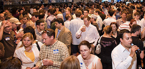
Back in Hong Kong it’s less crazy, but demand for quality talent still exceeds supply.
So how to compete?
Earlier we tried hiring an engineer position the time efficient (ahem…lazy) way - throwing up a vanilla job ad and waiting for CVs to roll in. We only received 8, none up to our standards.
Now with several to fill, fast, we resolved to do much more this time around.
Here are 10 tactics we used:
1. A fun referral program
We decided to slipstream off the recent Retina Macbook Pro launch by offering a new Retina iPad as thanks. It seemed to work, with several folks getting in touch and introducing their friends. We even had a random person coming to the office to drop a CV which was a first for us.

2. A personal email blast
To help spread the word, we pulled together a mass email to friends and connections we’d met. We started with a large list, filtering out those outside of Hong Kong (exporting from LinkedIn) and culling other game companies (no bad karma).

Whilst I couldn’t track open or click rates as I decided to use casual plaintext, the number of people who replied was over 15. So for a cost of around $5 it was a good investment.
3. Promote the jobs in-game

Having gained a nice global audience including Hong Kong, we decided to reach out . We have a dynamic welcome message that can be displayed on loading, and we coded it to display the referral program and contact email for those playing from Hong Kong. Sadly it was hard to tell the impact. In hindsight I should have put the call to action as a different address eg- to track the impact (note to self for next time).
4. Host and speak at events
One thing we’re doing more of in the last few months is having the team host and speak at more industry events (like held together with Unity3d at Cyberport). It’s good for the crew to hear from others and share our own learnings, and spread the word.
5. Targeted Facebook ads
Whilst the cost of posting a job on LinkedIn and Monster (not to mention a recruiter) would have been high, we found it more cost effective to do a targeted Facebook run. Of course the beauty of Facebook ads is the ability to hyper target based on location, demographics and interests. It’s something we’ve used a lot for different purposes in the past. Whilst the CTR is low as expected, having it in front of lots of relevant eyeballs helps in background brand building.

6. Give the company a face
A big draw for working at a startup is collaborating with a fun, smart team, unbound (hopefully!) from bureaucracy. A intro’d the awesome new folks joining the family and gave a sense of the vibe. This got good buzz out in the community…

7. Participate in Hackathons and Startup Contests
For programmers hands on events like hackjams and startups weekends are just a whole lot of fun and great chance to meet kindred spirits. Two of our team recently entered and won a Facebook hack day in Hong Kong. Working with an award winning team is one extra draw for potential recruits, and something we now highlight. How much does it help? Who knows but sure can’t hurt…

8. Get press
How to get press coverage? That’s another post which luckily my friends at Buffer have . You don’t need a million users to get that - it helps, but frankly not as much as an interesting story angle. Startups almost always have compelling tales and takes, so usually there is a pitch that can get coverage.
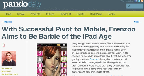
In our case we recently got coverage by several great . Doing PR costs less and only takes a few hours of creative thinking (more on that for another day)
9. Look at adjacent segments
If the need is niche and competition fierce, it may be better to look out to adjacent fields and skillsets. One of our shortlist game designer candidates ends up being someone from the fashion industry and she just loves playing all sort of social and mobile games. A reminder it always pays to…
10. …think outside the box!
Lately I’ve seen some great examples of startups thinking different in recruiting talent, from offering (expensive) through to (cheap).
You may not come up with something that makes the front page of Hacker News and a gazillion page views, but chances are just by making an attempt you’ll end up doing more than the other companies, which is half the battle.
And our result?
Going beyond the usual job ad generated more than 200% more candidates, at approximately 50% extra cost. Whilst it’s hard to isolate the impact of some of the tactics (mostly my bad!), all up it was worthwhile.
We’re able now to fill two of the three open positions. Still have to work hard to fill a final programmer position, but we’re in much better shape.
Lesson learned - when hiring, you usually get what you put in. Getting more creative and trying more things helped turn around our first failed attempt.
What tips do you have for hiring? me or
ps - for friends reading this in Hong Kong, and giving iPad’s for successful referrals… but you knew that already ;)
When I first of Greplin via a flurry of news from elite tech blogs, I fell in love.
Finally, a way to search all my stuff - Gmail, Google Docs, even Facebook in one single search - brilliant! And they were by Sequoia, generally a good sign.
The first weeks I used the service a lot but over time, less and less.
Why?
I found I didn’t need to use it that often, and when I did, I didn’t.
The handful of times I remembered to use Greplin though it worked pretty well.
In most cases though local and a search in one of the web services did the job. And in the rarer cases that didn’t work by habit I would go through them one by one until I found what I was looking for.
So in the end, something I thought would be a hit turned out the opposite.
What startup lessons am I taking away from Greplin’s ?
Goodbye Greplin, and wishing the best…
What lessons would you draw from this? me or
Your app icon is like a shop front, on a very busy retail street.
Warm and welcoming*, interesting and attractive and you’ll encourage people to wander inside and check it out Drab or shabby (drabby!) and few will bother to look.
* I mean seriously, who could resist that cute a baby ?
It’s clearly something people think is worth investing in. A co-founder of a top game company told me it took them 3 months to come up with the icon for one of their monster RPGs. For our first game we tested over 64 different versions on the way to identifying a winning .
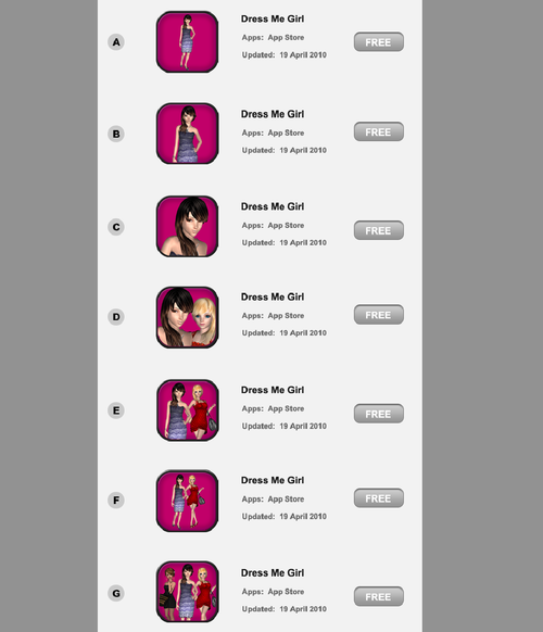
One of the many tests we did over the course of several weeks
So how do you actually conduct an effective a/b test to come up with a great icon?
There are several ways - here are a few approaches in order of increasing accuracy.
1/ Good
One easy way to run a very fast and cheap test is to use a service like . They do simple A vs B tests, typically as a front end to a crowdsource platform like Amazon Mechanical Turk, where the participants are asked which they prefer.
Pros:
Cons:
2/ Better
Next up you can use a platform like . This let’s you deploy multiple versions in parallel out in front of many eyeballs and measure click through percentages.
Pros:
Cons:
3/ Best
The best way to test is to actually test with a real audience in the context they would discover your app once launched (ie ads and appstore charts). For iOS and Android this can mean ads on networks including AdMob, iAds, inMobi, Millenial Media etc You don’t want to use incentivized channels like offerwalls as they aren’t an accurate measure of actual self-generated user interest.
Beyond just clickthroughs, you can also measure true conversion to installs and app opening, by integrating the ad networks’ SDKs. Ie- do the players feel your game description and landing page reflects what they were interested in, which was the icon. (A whole another story on whether the game matches to what they expected when they installed)
What if you app isn’t already launched? Then you can setup a separate test account and run the ads to point there. Android is good that way. Also you can restrict the test app and campaign to certain geographies if you want to keep it fairly low key.
Pros:
Cons:
How do you come up with a great icon? Let me know by or

It’s not often you get to hear from a game designer whose work spans multiple genres, from blockbuster social games like Farmville while at through to girl games hits like My Horse for the iPad and many more.
Raymond Holmes of gave a talk at the Innovation Lab last night on the different games he has designed and what he learned from them:
1/ Minimum viable product can be very “minimum” if you’re early
Farmville was pulled together in an incredibly short amount of time and with a very small team. It went to show that a MVP can be very “minimum” and still succeed, particularly in the era of freemium and games as a service with fast iteration post launch. He cautioned that it only works if the market is new, but given all the rapid evolution in gaming platforms these days there are likely to be plenty of situations where that remains the case - there are plenty of new markets that don’t even exist yet in gaming.
2/ Learn to think from a user point of view

One of his early gigs was helping design Barbie Team Gymnastics. The game did well and taught him “the important ability to design from a player point of view”. It was a game that clearly he wouldn’t enjoy playing himself, but he learned a lot about the actual players who enjoy that type of game and how they play and interact. That resonated with my own personal experience in designing .
3/ Leverage what you learned from the past

At Barbie Team Gymnastics, he learned a lot about gymnastics - animation, theory etc. And later when he was on the team creating Aeon Flux, it was decided the lead protagonist would be much more acrobatic, and his past experience led perfectly to the new game. His lesson? Leverage what you have learned and have an open mind to new topics - they could be useful in the future too.
4/ Monetization has to be appropriate to the audience

It was interesting hearing about his experience with My Horse - on one hand an extremely popular game with over 10 million downloads for iPad but relatively speaking, low monetization. Why? Because a lot of the level grind mechanics in the game didn’t match the audience - young girls and boys. They simply didn’t “get it”. In hindsight, his opinion was that it could have been better to have designed more of a pet simulator/dress up style of experience to match those who love the game. That said, it’s hard to argue with the success of a product that has driven that much traffic and surely a good amount of revenue.
5/ And finally… every game needs a WOW moment

Raymond made the observation that the moment players fell in love with My Horse was when they first saw the horse in the field, animating and interacting with the player - truly a wow moment that emotionally hooked them (we see that when players first see their stylist interact to their touch). He recommends all games try to establish a WOW moment early on in the experience to get them engaged.
All up, some excellent tips from a very experienced and creative talent.
Any feedback?
This is a repost of an article I wrote recently for Amazon’s app developer blog last week. The original is available
Guest author Simon Newstead, CEO of Frenzoo, discusses designing games for monetization. In it he uses examples from Frenzoo’s Style Me Girl, the first 3D fashion game on mobile. Simon can be reached at .
Our debut game Style Me Girl gained impressive downloads in its first two weeks, reaching the #1 position in the Amazon game charts. Whilst the downloads and rankings were nice, what made us really happy was the monetization, with Kindle Fire performing particularly well.

To look at what drives monetization it’s always helpful to look at the core game mechanics:
1. Incorporate a storyline
No matter the game type, if your game has levels, story serves up more motivation for players to progress through them. Players are emotional beings, and we are all compelled to be drawn into a good story. In our case, the game could have functioned just fine without a story line. However we saw from player feedback a deep engagement with the protagonist and goals in the story arcs. Given how little engineering resource is often needed on story, the ROI to include it is usually pretty compelling.
2. Replayability and collectibles
One thing that drives many paying users of Style Me Girl is successfully completing all levels with perfect 3 star results. Why? Of course completionism plays a part but the main one is being able to win rare “signature edition” items. These cannot be bought in the shop and a sign of success is sporting an outfit featuring 1 or more signature editions. It’s always good to make room for replayability and collectibles can play well in that.
3. Energy and speed up
It’s a cliche but it’s true - impatient players are paying players. Energy regeneration through paid items is a proven way to open up the purse strings. We saw that in Style Me Girl and cash purchase, even though Style Catch itself is just a game to let you earn the soft currency. Strange but it works.
4. Aesthetics and functionality
Whilst studies show that pure aesthetic items don’t monetize as well as time saving and functional virtual goods, if you can combine them together that can work extra well. In our case the cash items bought in the shop are attractive fashions, which lets users both look good and play good. Combinations are always good. Think the success of Toms, based on looking good and feeling good about it. Or owning the latest Macbook Air, a style statement as well as solid productivity tool.
5. A/B testing
Like eating enough fiber, it may not be a glamorous part of game design but it certainly is necessary to get the most out of your game. We implement A/B testing in the major parts related to the in-game economy - coins earning rate, starting currency values, purchase conversion rate etc. We don’t go to the point of A/B testing individual item prices yet though, but that’s the direction. Running tests has helped us increase monetization while not affecting retention (not always the case), and it’s something we’re going to dive into even further.
These tips are certainly not rocket science and not the first time they have been used in games.That said, keeping these fundamentals in mind when designing your next game ensures you’re getting biggest bang for your development buck. And that makes everyone happy.

Ah controversy :)
It stirs up emotions when it’s on a topic near the heart - like our debut game, lovingly crafted over several months.
Amid the positive articles on our Style Me Girl launch from , and others, one popped up by from a very different angle:
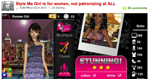
Jim’s view as I read it was that a fashion RPG designed for girls and women playing as a stylist was patronizing. His final paragraph:
Rejoice, GURL GAMARZ, no longer will you have to play Calling Duty or Grand Auto Grab with those smelly boys. Now there is a game that you little ladies can play while you’re shopping for shoes and thinking about kissing the high school leader of the footbasket team. Aren’t you lucky?
Well before responding, to be clear I have a lot of respect for Jim and his work. He’s among the best in the business and it’s refreshing to see someone call it as they see it. Not to mention it’s way more fun to read, which is why I count myself as one of many Destructoid fans.
That said I have to respectfully disagree and respond:
And whilst there was plenty of debate in the comments, it’s good to see others in the Destructoid community who feel the same way:

Anyway long live freedom of opinion and choice. Now it’s back to work :)
During a whirlwind trip to Hong Kong, I was asked to talk on raising a seed round, something we recently .

*Groan worthy event title, I know :)
During it I mentioned prepping likely investor questions. Here is my list of 100 in no particular order:
*I was the vast majority of these at one point or another during the round…
Full slides:
Any feedback? Email
Was up in LA last week for my very first E3.
Glad I came. Bunch of awesome meetings mostly at JW Marriott, Millenium Biltmore and other hotels dotted around the convention center.
The time I spent actually at E3 itself, walking the show floor didn’t leave me with as positive an impression.
Take this “promotion” for THQ’s upcoming Darksiders 2*

Really THQ?
In this day and age must we objectify women to promote an apocalyptic action game?
Yes I get it, you’re targeting a male audience. And guys just like looking at sexy girls, no matter the product right?
This type of mindset is holding the industry back.
*I use Darksiders 2 as an example, plenty more on the show floor..

Love being surrounded by intense folks…
Took this pic today, all crunching late into the night despite the public holiday.
Factory 0 is a startup house I’m staying at in San Francisco. Startup mansion would be another way to describe it (this place is huge!) but would give it the wrong connotation: the work:party ratio is disturbingly high.
There are hackers, creatives and product guys. Companies with tons of users through to nascent ideas bubbling into life right next to my desk.
Yes it’s noisy, gets untidy and feels like a dorm. But the energy is inspiring.
Couldn’t imagine staying in a boring hotel any more…

So you’ve made a great iOS game, prepared your launch and are ready to submit.
Now how to pick your App store sub/categories?
Ranking within these subcategories after all is a critical part of picking up organic users, which is important for a successful game launch.
“Easy!” you say… “Just pick what your gut tells you perfectly fits your game, you dummy!"
Fair enough, but what if your game fits into multiple subcategories, then how to decide?
Like in our case with our first .
Hmm let’s see…

Ugh….where the heck should it go?!
Having found no obvious choice, my inner engineer was itching for a number based approach to decide.
Searching around uncovered some great sources including by Casey Fleser, which I then stripped down to the possible categories and honing in on iPhone.
So let’s look at the % of top free iPhone games in the target subcategories:
Arcade 26.75%
Simulation 18.50%
Family 14.25%
Kids 13.50%
Puzzle 13.00%
Strategy 11.00%
Role Playing 8.50%
According to this the clear loser is RPG and clear winner is Arcade - that must be the one with the most demand and therefore the biggest demand, so just choose that one right?
But hang on, whilst there are a lot of players in that category, competition must be strong right, even for a unique game?
And does biggest demand mean biggest profits?
So let’s look at another way to slice it, by % breakdown of top grossing games:
Simulation 24.25%
Role Playing 20.75%
Arcade 20.00%
Strategy 17.25%
Family 10.50%
Puzzle 9.75%
Kids 5.00%
Hmm, the picture changes significantly. Arcade isn’t on top now. It isn’t even #2nd…
So let’s take another way to slice it, this time by ratio of top grossing to top free ranking. ie- which subcategories were over or underperforming relative to their competition / volume.
Role Playing 244.12%
Strategy 156.82%
Simulation 131.08%
Puzzle 75.00%
Arcade 74.77%
Family 73.68%
Kids 37.04%
That seemed better.
Now we had the top subcategories that had the best "bang for buck”… and what we ended up running with:

Results?
The game ended up hitting the Top 10 free RPG game in over 15 countries. We also hit Top #10 in our secondary subcategory, Strategy, in a bunch of countries. Given it was a first launch and we had and still have a lot to learn, we were happy at how it turned out.

Lessons learned
Caveats and notes
* Although it would be interesting to explore the impact of a “novelty” choice that sticks out of a “wrong” category. Perhaps an interesting future blog topic…
famously said that doing a startup was akin to jumping off a cliff and building a plane on the way down.

Today it feels more like defusing a bomb that also decided to jump off the same cliff.
This morning after a great first day of (already in the top 100 iPhone games in USA, OMG!) we were riding high and ready to conquer the world.
Then we noticed ratings much lower than we had previously in our public beta. There we rated ~4.5 stars, but in this launch version we were at ~3.5 stars.
Analytics also bore that out, with ~10% of players worldwide having major problems.
And in in around half of Europe the ratings were simply horrible:
Some frantic troubleshooting isolated one problem with number format, with commas used by many Europeans triggering the bug. Damn!
Given the time to get Apple to approve a fix, we had to make a snap call to withdraw from these affected countries. Then we’d launch again there with the next update.
In the US though, only a minority were having problems so we decided to continue on. However we did make some remote server changes to improve the new user experience for everyone and hopefully counteract some of the negative ratings. Short term crisis averted.
Lesson learned: Test more, but stay nimble to handle anything.
Now on to the rest of the plane :)
It’s THE challenge for mobile app developers.

How to get a new app noticed amongst literally a gazillion others?
I’d been mulling this over leading up to the launch of our first .
We were confident we’d created something unique and fun. But would any even get to see it?
So a plan was put together leading up to a big (for us) marketing campaign:
1. Private alpha on iOS to validate MVP (done)
2. Public beta on Android to tune for monetization & retention (done)
3. Launch on iOS as a paid app for final run with testers and friends (last weekend)
4. Change price from paid to free in preparation for marketing (yesterday)
5. Begin our marketing campaign (starting later today)
Whilst the real judge of the plan will come out of #5, something interesting came out today in this part*
4. Change price from paid to free…
We found though when we changed from paid to free, within an hour we started appear on several “Sale Alert” sites and apps:

Which then corresponded in our analytics to a big uptick in the new install rate:
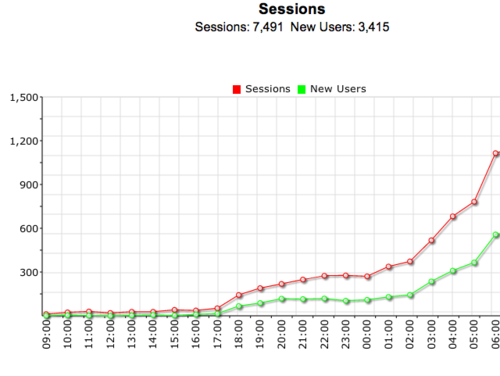
Which in turn led to our game starting to appear for the first time on several charts:

We originally went out as paid to discourage people from downloading and give us a chance to iron out kinks before starting marketing.
And by doing that and subsequently dropping to zero, we got thousands of installs in a few hours.
All before spending a single dollar on marketing.

Caveats:
* ps - I’ll be blogging about the result of the marketing campaign and other parts in coming days, lots of fun things to share
TL;DR - Domain squatters are smart. Be patient & plan well.
In the movies, hostage negotiation always seems glamorous.

Cool negotiator in shades. Panicky terrorist. An easy dance into submission.
I thought acquiring a domain name from a squatter would be similar.
I was wrong, totally.
While planning our new 3d mobile games, we had decided we needed a new brandname separate from .
After naming our first game beta Dress Me Girl (as generic as it gets, I know) we decided we actually quite liked the sound of Me Girl. Easy to spell, catchy in a “Me Tarzan and You Jane” way and surprisingly warm and personal. Bingo!
Of course, was already taken.
By a pro squatter with over 10k .
Ok, time to roll up the sleeves.
I studiously read Fred Wilson’s “” post, dusted off an old yahoo account and shot off the first mail, copied and pasted from another article I found at the top of Google search:
Hi,
I saw that this .com domain “megirl" is parked. I wondered what are your plans for it. If you don’t have plans are you interested in selling? If yes, what would be your starting price?
Thanks
The reply within two minutes gave me a shock:
$75,000.
, buyer pays fees.
This offer expires 3/27/12.
Thanks.
Wooah….$75k? For 6 measly characters? Let’s try something more reasonable…
Appreciate the reply.
Unfortunately that’s above my budget.
I could offer $12,000
A heartening reply…
Alright, just a matter of a few more emails and we’d down to something reasonable. I progressively raised my offer to 20k, which I told him was my final limit. Over the next days, he refused to budge. So I even went for a hail mary:Thanks for the offer. Can’t accept, sorry.
How about $45,000.
ok so we can’t agree on up front cost, but how about one last alternative:
Rent for 3 years for $16k total (paid up front) with the option for us to buy the domain for $30k at any time during the 3 years
ie- you’d get your $US 46k price
either way, you make an easy 16k while you’re waiting for someone who will buy it from you, either us or someone else
Surely this would appeal to his greed, a deal he couldn’t refuse?
At this point I had gone through the 7 stages of grief except acceptance. Anger at this guy, denial, you name it. I seriously considered splashing down the $45k (not that I could ever justify it, even with fresh ). Luckily a friend pulled me back to reality and I ended up walking away and reluctantly buying the corresponding .me alternative. I thought that would be the end of the story.I appreciate the offer. Can’t accept. Sorry.
But sure enough, a week later:
$30,000.
, buyer pays fees.
This offer expires 4/9/12
This time it would be my turn to go hardball, and it felt good!
$20k was my final offer. No budget to go higher.
Finally:
Okay, that’s a go
Awesome! A brilliant name for a fair, perhaps even good price.
was purchased and put to good use:
Looking back though I realized why he was sticking to $45k for some time. Why? Because it was just under the $50k Fred Wilson had recommended to spend on a great domain name. I nearly fell for it.
I had to admit how unprepared I was and how I should have approached it in hindsight.
Negotiating with domain terrorists: Lessons learned:
Startup founders vs domain terrorists, unite.