A/B testing your icon (good, better, best)
Your app icon is like a shop front, on a very busy retail street.
Warm and welcoming*, interesting and attractive and you’ll encourage people to wander inside and check it out Drab or shabby (drabby!) and few will bother to look.
* I mean seriously, who could resist that cute a baby ?
It’s clearly something people think is worth investing in. A co-founder of a top game company told me it took them 3 months to come up with the icon for one of their monster RPGs. For our first game we tested over 64 different versions on the way to identifying a winning .

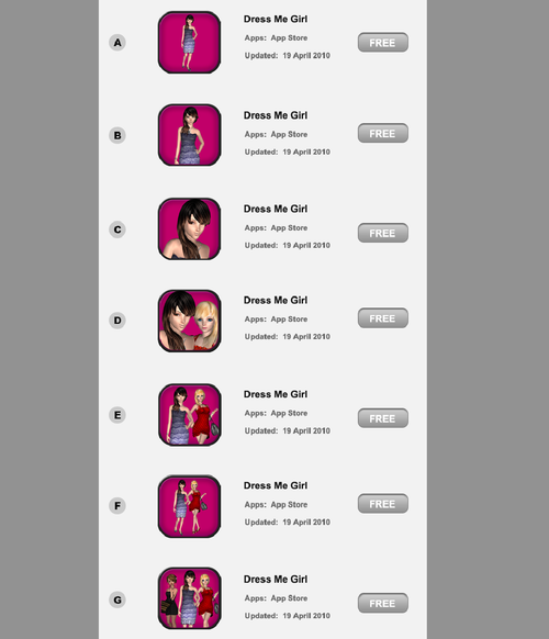
One of the many tests we did over the course of several weeks
So how do you actually conduct an effective a/b test to come up with a great icon?
There are several ways - here are a few approaches in order of increasing accuracy.
1/ Good
One easy way to run a very fast and cheap test is to use a service like . They do simple A vs B tests, typically as a front end to a crowdsource platform like Amazon Mechanical Turk, where the participants are asked which they prefer.
Pros:
- Cheap
- Very fast
- Ability to filter by demographic
Cons:
- Bias of tester self selection
- Subject to participant self awareness
- Lack of real intent and context
2/ Better
Next up you can use a platform like . This let’s you deploy multiple versions in parallel out in front of many eyeballs and measure click through percentages.
Pros:
- Fast
- Ability to target by interests, demographics
- Less bias
- Flexible sample sizes
Cons:
- Intent and context is closer but not same as real intent
- Can cost a lot depending on sample size to get statistical significance
3/ Best
The best way to test is to actually test with a real audience in the context they would discover your app once launched (ie ads and appstore charts). For iOS and Android this can mean ads on networks including AdMob, iAds, inMobi, Millenial Media etc You don’t want to use incentivized channels like offerwalls as they aren’t an accurate measure of actual self-generated user interest.
Beyond just clickthroughs, you can also measure true conversion to installs and app opening, by integrating the ad networks’ SDKs. Ie- do the players feel your game description and landing page reflects what they were interested in, which was the icon. (A whole another story on whether the game matches to what they expected when they installed)
What if you app isn’t already launched? Then you can setup a separate test account and run the ads to point there. Android is good that way. Also you can restrict the test app and campaign to certain geographies if you want to keep it fairly low key.
Pros:
- Truly unbiased and representative audience
- Accurate context
- Flexible sample sizes
- Measure actual conversion
Cons:
- Takes time to integrate SDKs, approve creatives and measure - cycles are longer
- Can cost a lot depending on sample size to get statistical significance
How do you come up with a great icon? Let me know by or
