It was fun to talk about live operations, specifically time limited* content and mechanics, at this year’s .
I’ve uploaded my slides here, which cover:
- The different types of live ops
- Why game developers should care?
- Some industry examples, including one of our own
- Lessons learned
* new levels and missions etc also falls under the topic of live ops but the slides focussed in on time limited content.
The talk itself was only 20 minutes which was a shame as it’s a fascinating topic and lots of interesting things to go into (eg- pros and cons of different contest mechanics etc)
Any great examples of live ops out there? Share on or
New iOS, new App Store…
If you’re like me, it’s time for optimism with a touch of dread. Are the changes better or worse for my apps? My players?
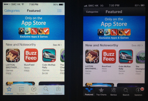
Recently checked out the Appstore in iOS 7 vs iOS 6. Overall it’s a step forward and imho mostly positive for devs. Here are the side-by-side iPhone screenshots. Recommendations at the end.
Featured Page

- More new and noteworthy spots shown before requiring you to tap “see all” (around a third more) means more chances to get your game downloaded if you’re one of the lucky few selected by Apple
- larger icon spacing, in general through the App Store
- Rest is pretty similar
Top Charts

- Ratings now included (total number, not just for current version)
- More downloads for the long term hit games
- Now autoscrolls down to see the list, instead of to the right
- Not requiring you to tap “See All” reduces friction
- More download for those popular games not in the top 25
- Easier to access top grossing = more downloads for the monetizers
- Category button is more prominent, meaning more spread of downloads
- Rest is similar
Category navigation

Subcategories - eg Role Playing

- New vertical scrolling layout, same as top charts (above)
Near Me vs Genius

- Genius is dead - less organic installs for game devs (though hard to tell how many it drove in first place - wasn’t a strong UX)
- Favours locally popular apps (events, venues etc) - though for gaming that probably doesn’t matter as much, especially with country specific App Stores
Search

- Search algorithm seems the same so far
- Shows number of results in search bar
- Larger screenshot
- Shows review count (all versions) - favours older games
Screenshots

- Second screenshot matters more than before - more now shown
App Main Page

- Larger game icon (can put text in there)
- Link to the Related tab for more apps from the developer (better for organic intraportfolio growth)
Reviews Page

- Pretty similar, now shows more reviews before hitting the button
Related Page

- Similar with some sizing changes
My take
- Your higher monetization games should get a bit more organics now
- Less pressure to be up in the top 25 - download spread broader
- Trying to do well in a single subcategory is a bit easier now
- No more free lunch - whatever Genius gave has been taken away
- Pay attention to the left of your second screenshot
- Keep trying to get your app featured, more chance of impact now
-
Your rating and rating count matters more than ever - focus on quality and genuine ways to get more reviews
ps- big thanks to ‘er Jer for pulling this together!
Your thoughts? Have I missed something? Share on or

E3 was manic.
A whirlwind of next gen consoles and triple A titles.
This year I roamed the show floor trying out as many games as possible.
Most were bigger & badder takes on familiar genres.
on Xbox One was stunning. ’s animations flowed better than ever. had gunplay, underwater! Ubisoft’s pulled us into an immersive wired city. Oh and mechs are !
So what about non core games?
Not that many.
With a of most of the industry remains focussed on its male core gamer demographic.
There were bright spots though - 5 personal highlights:
1/ That Dragon, Cancer

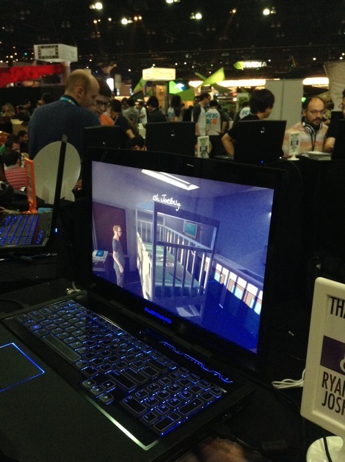
Not so much a game as a thoughtful piece of art. The setting is a sad hospital room, the character a cancer patient and his thoughts. This had the most emotional impact, despite the lack of fancy graphics.
2/ Project Spark

Little Big Planet and Minecraft just had a love child…
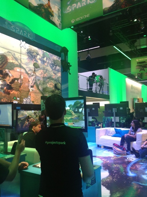
This was the most awe inspiring demo at the event. Microsoft’s ambitious game creation is a joy to play with: the first time you swipe your finger and literally create worlds of ice and forests before your eyes takes your breath away.
3/ Octodad

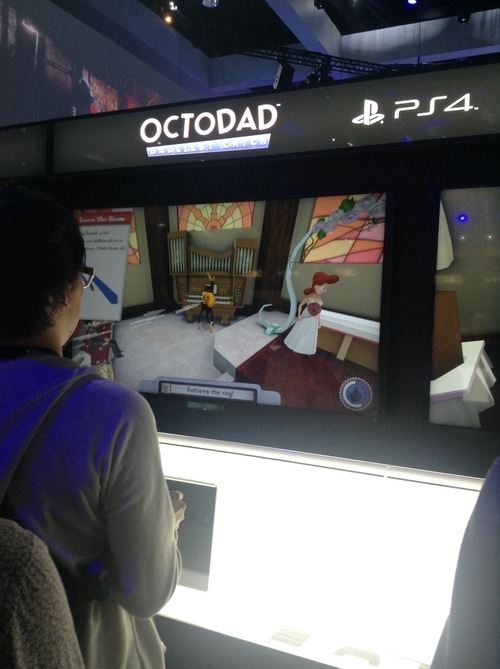
Octodad is so ridiculous in its premise it can’t help but bring out the smiles. Trying to control Octodad’s clumsy tentatcle to retrieve a wedding ring for your (female) bride is a farce, in a good way. The game bursts with personality and character, a welcome contrast to all the high speed action and violence in the rest of the PS4 zone.
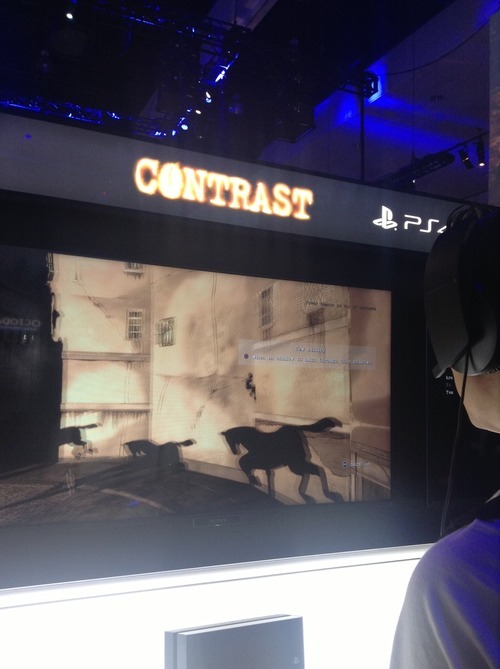
4/ Contrast

This action leaves a dark impression. Contrast has intriguing female leads, gorgeous french noir art and a gameplay twist. When your character’s shadow is on a surface you can change modes and control your shadow in 2d, moving and jumping amongst other shadows. Whilst frustrating in its controls it pushes the boundaries in creative gameplay.
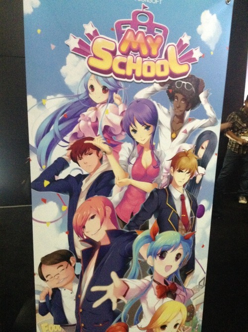
5/ My School

Not sure whether I’d call this a highlight or not, but worth a mention. This over the top school simulation game features plenty of “only in Asia” quirkiness (maybe fitting from a studio called Racoonsoft). Busty teachers, an overabundance of cola machines and confused students looking for work, this game had it. When I asked the goal of the game, I was told it was “to make money”.
Education these days :)
ps - special mention to - who knew 101 character multiplayer chaos could be so much fun…
What were your E3 highlights? or let me know on

New bootstrapped startup?
Building a new app?
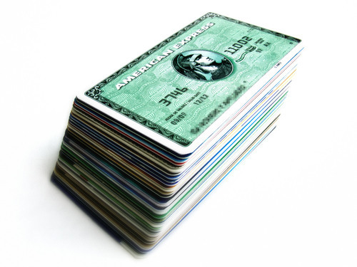
Ready your credit card.
Back of the envelope costs
- Surveys to your target market $1000
- Starbucks focus groups and usability tests: $200
- Buy 1000 quality users to your new app $2000
- x 5 rounds of product iteration = $16,000
Based on
- $1 per response x 5 questions x 200 qualified respondents
- $20 coupons x 10 people (random & Craigslist arranged)
- $2 targeted CPI x 1000 users
Conclusions
- If you’re running lean, early on it’s probably your biggest cost
- Good news: still cheaper than months of wasted design & dev effort
Footnote
- Chances are you’ll need multiple iterations (maybe it’s just me)
- Figures excludes dev, launch marketing, hosting, pizza etc.
- Asking friends for feedback is cheap, but biased
- You’ll 1000s of users to test LTV in a freemium product
Question - is there a cheaper way?
What’s your take? or let me know on
Note - this was a guest for TechInAsia, a great site for APAC startups.

If you’re doing a startup, there’s allure to a big brand partnership.
You might think: close a deal in a couple months and then prestige, validation, press, growth, new opportunities etc…
“If I get this deal we’ll be up in the bright lights!!”
Except it doesn’t usually work that way.
The reality is more like:
- getting a foot in the door is hard
- getting to a signed contract is grindingly tough
- getting a successful partnership that delivers real mutual value is the real challenge
- doing this all without getting sidetracked and “accidentally” burning your precious runway… hmmm
Our success and failure
My startup has worked with a few large brands in the past year. One failed draining precious cycles. A couple though turned much better, including a successful collaboration with media giant on new game , launched after months of hard work.

Here are some 8 startup lessons learned:
Lesson #1 - Press is overrated.
If your main goal is “buzz” that will lead to more downloads / users / revenue for your startup, brace for disappointment.

Even a mention in major media such as Tech Crunch translates to only a temporary spike (we’ve seen this). A friend got a top tier celeb to promote his new startup, resulting in far less returning users than he hoped.
We all remember glitzy press launches for projects that end up failing a year later. And those that rose to success without PR. Our new game got only a of editorial pieces but has still grown well despite it.
Whilst press can help for other reasons (eg- fundraising), a partnership is a pretty risky and resource grabbing way to try and achieve those goals.
Press is icing on the cake, rather than the cake itself.
Think about press as a great bonus only - if you don’t get it, no worries, a solid project will still thrive without it.
Lesson #2 - Is your opportunity cost acceptable?

Doing any project with a Fortune 500 company is going to take more time than you expected. Much more time.
Our project took nearly 6 months to deliver, and that’s fast.
Big brands need multiple approvals with different stakeholders, reviews with marketing and legal, endless back and forwards on product etc
If you’re a small startup and think you can create a brand new app for a brand whilst maintaining momentum on your “main” business, think again.
You’ll need to either hire up, rework what you already have, or try to turn your tech into a platform…or accept that THIS is your startup, and that your prior project will have to wait, perhaps forever.
Our project that failed in the end turned out as a good thing for us -whilst famous and adored brand to be associated with, it was turning into a large departure from our existing path (high opportunity cost) without enough strategic benefit.
Lesson #3 - Work with the right advocates

In a big company, it can be easy to find groups who may be interested and engage you in promising discussions that end up stalling.
Before committing lots of time with a group, some good questions to ask:
- What is the group’s mandate and business goals?
- Do they have budget?
- Do they have buy in from the relevant business units?
- Have they executed a similar project?
- Who signs off on a potential project?
- Do they have resources to commit to the project?
- Etc
In our case, we found an innovation products group who had a track record of projects and getting buy in from the different Conde Nast brands, and brands willing to embrace a new project - which got it all started.
Lesson #4 - Define your scope up front

Whilst in lean startup land we work iteratively and adapt, doing this with a brand that changes scope every week is a recipe for chaos at the least.
Small innocent requests - “oh can we add a module to let the customer redeem coupons through the website as well as the app?” can snowball.
Though there are pros and cons, I think it’s better to agree a list of deliverables and put it in writing early.
But how do you get it “right” from the start?
A good way is to either adapt from something that is proven to work (we based the new game on a mechanic from our first game) or do the upfront customer development and planning work to make sure it has as high chance as possible at success.
It’s a tricky one.
Lesson #5 - Harness the supertanker.

Big companies have processes, legacy and move slowly.
Startups are lightweight speedboats, deciding and moving quickly.
So what gives?
The natural instinct may be to try and bend the big company to your way and pace of working. This will lead most likely to frustration. Yours.
Instead, adapt to their way of working and get the big supertanker pointed in the right direction and let it power through.
For example all our normal task planning is through Google Docs. On the other hand, our partner did planning through Excel spreadsheets and a project management system. After a while, we just ran with it, and made sure that ALL the things to make the project succesful were included.
Once they were “locked in” the system, they just got carried through their usual process and happenes. If you focus less on the “how” and more on the “what” you can make the big company ultimately work for you.
Lesson #6 - Get the term sheet in place early

Legal contracts are one of the least enjoyable things a startup CEO has to deal with (after emptying trash and 4am server down emergencies).
Crawling through pages of minutia to spot potentially lethal gotchas doesn’t help you make your app even better.
And you may, like me, suck at it!
I’ve found a couple of ways to lessen the pain:
- First, get to a simple term sheet with the key points agreed up front, that can be signed off and act as the letter of intent. This should be no more than a few pages written in plain English. Once you have this in place, you can commit and focus on the project, and in parallel take your time with the legals.
- Get experienced mentors to help review the deal and legals. In my case with Frenzoo, I’m lucky to have a few angel investors who have plenty of experience in contracts, and act as sounding boards and sanity checks. It also helps to have a lawyer or two on your investor or advisor team (pro-tip, thats a HUGE advantage for an early stage startup)
Lesson #7 - Secure a budget.

Startups think burnrate, but big companies think budgets and headcount.
Are they going to contribute marketing to the project? Then what budget will be spent, by whom and where?
Are they going to be doing part of the work on the project? Then who is allocated and for what percent of their time?
Ensure your project has resources allocated and if not, ask nicely for it. If they are not sure, then request a good number and discuss from there.
Having these in place rather than a “best effort” will increase the chance of making it a success.
Lesson #8 - Does your head and heart align?

Back when we were still doing virtual worlds, we did a collaboration with Weta. As a big fan of Lord of the Rings & King Kong etc I loved this deal!
We would collaborate on a contest to promote their steampunk sci fi brand. The problem? Our audience, mainly women, weren’t into that genre. Despite it being well executed, it didn’t either make our service more sticky nor drum up more buzz for their brand.
The lesson? At the end of the day, only go ahead with a partnership if it really makes sense at both emotional and business level.
If head and heart line up, chances are it’s worth to pursue. Good luck!
What’s been your experience? I’d love to hear: or
For a startup game company, does brand matter?
A while back I sought wisdom from a group of experienced tech entrepreneurs, all of whom had built successful companies:

That makes sense.
Why build a brand?
In an age of and cluttered app stores, having a strong brand for your portfolio is more important than ever.
Increased brand equity to increased customer lifetime values.
A strong brand will convert better in cross promotion and organic adoption of apps from the same company, offsetting rising CPAs to individual titles. A friend at a large mobile studio with many games, estimated the brand uplift factor to be over 20%.
And basic brand building doesn’t cost that much, making it startup friendly.
Yet why is branding is usually the last thing on our minds?
6 months ago I would have counted myself in the “product is the ONLY thing that matters” camp, yet now I’ve switched camps…

These may be great games, but would players know these are from the same company?

On the other hand, how could a player who enjoyed Tap Paradise Cove and loves cute animals NOT want to play Tap Pet Shop?
How to do it?
Ok, so it’s important, but for us engineers or designers, where to start?
Having gone through the process with , I found working through these 5 questions was very helpful:
- Who is the target player & market?
- What are your core brand attributes?
- What does your brand stand for? (emotional connection)
- What will identify your brand to players?
- What games and features strengthen the brand?
Let’s go through them one by one:
1. Who is the target player & market?
Yes, the easiest one! You’re making a game, you should have a primary audience in mind. eg-
- We’re making strategy games for high income males over the age of 25
- We’re making lifestyle games for adult women
- We’re making racing and sports games for boys up to the age of 14
What if you believe you’re making the next Angry Birds, a game that will be popular with literally everyone?
Creating a game like this is difficult. While you might strike it lucky, your chances for success and monetization go up if you create games designed and branded for a target group of players. Even mega hits like Temple Run and Words with Friends have their primary markets (teens and adult women).
Defining player personas, who you’re building for, lets you really dig in and understand:
- Who are they?
- When do they play?
- What do they play on?
- What other media do they consume?
- What issues are important to them?
- What challenges do they have in their lives?
- etc
This will provide your base for the next step…
2. What are your core brand attributes?
If you had to pick (and you do!) what are the 2 or 3 things that are unique to your brand. Put another way, what makes you different from everyone else out there?
Let’s look at some examples from mainstream:

- Toms - style with a social conscience
- Nike - personal achievement
- Walmart - large selection and low prices
In our case with Me Girl, after brainstorming and a surprisingly difficult process we settled on 3 brand attributes:
- Personal - games that relate to my life
- Playful - games that can laugh at themselves
- Inspirational - positive games that inspire me
Even though our first title was a fashion game we decided not to go for the high-end aspirational position ala Louis Vuitton or Jaguar, which we felt could exclude some players. In fact a brand that appealed to Ashley, Christina and myself (our little branding crew) and seemed most in the Me Girl spirit was Ellen:
It helps to ask “if your game was a TV show, or car or fashion brand… what would it be?”
Once you have gone through this and settled on your brand attributes, it’s like you’ve found your North Star. It will help guide you in decisions from here on out.
3. What does your brand stand for? (emotional connection)
The strongest brands form emotional connections with consumers that often override logic and reason.
Low cost rubber and fabric stitched in a factory in Indonesia can inspire people to “Just Do It”. People will queue for days for the latest iDevice. Overpriced headphones from Beats convey urban cool and freedom from authority:

It opened our eyes - when we A/B tested taglines for Me Girl, we found emotional phrases like our final choice “Fabulously Me” converted much better than impersonal choices like “Games with Style”.
“Fabulously Me” sums our mission: to make women feel fabulous while playing our games. Regardless of age, looks, body shape, status in life, challenges…everything.
This is what our brand stand for.
If a brand stands for something - Freedom. Challenging yourself etc., chances are players will care that much more in return.
4. What will identify your brand to players?
Once you’ve locked down your targets, brand attributes and emotional connection, it’s time to bring that to life visually.
Creating a match of logo, typography, color palette, audio, UI elements and animations in a cohesive experience that conveys your values is the goal. Honestly, it’s easier said than done (we have a ways to go) But we just consciously going through the process will often result in something good.

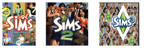
The venerable line and their “Play with Life” proposition does it extremely well, with consistent visual elements that a random 20-something on a street could identify in a second. And their music and audio right including their quirky Simlish reinforces a unique personality.
As we’ve seen with the Sims, branding elements that anticipate and can weave into future games, expansions and sequels is also important. Even more so in the age of mobile with more releases more often.
For us a future “Dance Me Girl” or “Me Girl Dancer” would fit nicely into the same family from a cross promotion perspective.

5. What games and features strengthen the brand?
Consistency is key - whether in art, storyline, mechanics, humour etc.
If decided to sell your personal info to shady direct marketers, how would you feel?

Likewise if you’re someone who enjoys Bubblez on and returned to find them pushing a hardcore dungeon raiding MMO, you’d probably be confused.
These are extreme examples of course, but there are plenty of choices that we all face every day:
- should I add a feature to simplify UI but reduce freedom in my simulation game?
- should the game be balanced to encourage free players or heavily favor paid users?
- what types of ads should I be showing in my freemium game?
- should I add a feature that lets you lose a lot of real money investment in PvP?
- what should my next game be?
- etc..
Knowing your brand values often helps in these questions - ringing an warning bell when you’re heading down a wrong path.
For example we could add competitive systems where you systematically tear down the reputation of others. Whilst “fun” from a game design perspective and helping short term numbers, it wouldn’t align with our “positive and inspirational” feel.
And on the flip side, carving out cycles to do brand building features that might not directly boost metrics but help players fall in love with your game brand can be worthwhile.
An ongoing endeavour
As we’re understanding, it’s not a one time activity - building a brand is an ongoing sustained effort that spans from game design, to engineering to marketing and even customer support.
Of course a great brand can’t rescue a bad game and it’s always a tough call to put precious cycles into something you haven’t before.
But assuming you are making good games, investing in brand building can add up to huge wins in the long term.
Any branding tips to share? I’d love to hear your feedback. or
Big thanks to our investor whose Mattel experience made us “see the light”!
Video from my at Casual Connect last month is now up:
1 Million Downloads in a Month – How Indies Can Make It Happen
Always trying to learn more - what other tips would you have included?
Ping me on or .
ps - new blog posts coming this weekend :)
Your app icon is like a shop front, on a very busy retail street.
Warm and welcoming*, interesting and attractive and you’ll encourage people to wander inside and check it out Drab or shabby (drabby!) and few will bother to look.
* I mean seriously, who could resist that cute a baby ?
It’s clearly something people think is worth investing in. A co-founder of a top game company told me it took them 3 months to come up with the icon for one of their monster RPGs. For our first game we tested over 64 different versions on the way to identifying a winning .

One of the many tests we did over the course of several weeks
So how do you actually conduct an effective a/b test to come up with a great icon?
There are several ways - here are a few approaches in order of increasing accuracy.
1/ Good
One easy way to run a very fast and cheap test is to use a service like . They do simple A vs B tests, typically as a front end to a crowdsource platform like Amazon Mechanical Turk, where the participants are asked which they prefer.
Pros:
- Cheap
- Very fast
- Ability to filter by demographic
Cons:
- Bias of tester self selection
- Subject to participant self awareness
- Lack of real intent and context
2/ Better
Next up you can use a platform like . This let’s you deploy multiple versions in parallel out in front of many eyeballs and measure click through percentages.
Pros:
- Fast
- Ability to target by interests, demographics
- Less bias
- Flexible sample sizes
Cons:
- Intent and context is closer but not same as real intent
- Can cost a lot depending on sample size to get statistical significance
3/ Best
The best way to test is to actually test with a real audience in the context they would discover your app once launched (ie ads and appstore charts). For iOS and Android this can mean ads on networks including AdMob, iAds, inMobi, Millenial Media etc You don’t want to use incentivized channels like offerwalls as they aren’t an accurate measure of actual self-generated user interest.
Beyond just clickthroughs, you can also measure true conversion to installs and app opening, by integrating the ad networks’ SDKs. Ie- do the players feel your game description and landing page reflects what they were interested in, which was the icon. (A whole another story on whether the game matches to what they expected when they installed)
What if you app isn’t already launched? Then you can setup a separate test account and run the ads to point there. Android is good that way. Also you can restrict the test app and campaign to certain geographies if you want to keep it fairly low key.
Pros:
- Truly unbiased and representative audience
- Accurate context
- Flexible sample sizes
- Measure actual conversion
Cons:
- Takes time to integrate SDKs, approve creatives and measure - cycles are longer
- Can cost a lot depending on sample size to get statistical significance
How do you come up with a great icon? Let me know by or
This is a repost of an article I wrote recently for Amazon’s app developer blog last week. The original is available
Guest author Simon Newstead, CEO of Frenzoo, discusses designing games for monetization. In it he uses examples from Frenzoo’s Style Me Girl, the first 3D fashion game on mobile. Simon can be reached at .
A Numbers Game
Our debut game Style Me Girl gained impressive downloads in its first two weeks, reaching the #1 position in the Amazon game charts. Whilst the downloads and rankings were nice, what made us really happy was the monetization, with Kindle Fire performing particularly well.
Mechanics
To look at what drives monetization it’s always helpful to look at the core game mechanics:
In our case with Style Me Girl, the primary is a fashion puzzle mechanic where the player must dress a series of models for different Photoshoots, each with a unique fashion genre. The game uses a proprietary judging algorithm to determine scores, taking into account the items used, the fashion genre as well as the attractiveness of the photo taken. Passing the level unlocks the next level (model and fashion genre), progressing the story. Story evolves with new levels added dynamically from the cloud each week.
The secondary is a casual “catch the falling item” mini-game called Style Catch. Style Catch escalates in difficulty and provides and increasing payout of coins, used for shopping.
A freemium game, Style Me Girl has a hard currency Cash (purchased via IAP) and soft currency Coins, earned in Photoshoots and Style Catch.
5 Tips for Monetization
1. Incorporate a storyline
No matter the game type, if your game has levels, story serves up more motivation for players to progress through them. Players are emotional beings, and we are all compelled to be drawn into a good story. In our case, the game could have functioned just fine without a story line. However we saw from player feedback a deep engagement with the protagonist and goals in the story arcs. Given how little engineering resource is often needed on story, the ROI to include it is usually pretty compelling.
2. Replayability and collectibles
One thing that drives many paying users of Style Me Girl is successfully completing all levels with perfect 3 star results. Why? Of course completionism plays a part but the main one is being able to win rare “signature edition” items. These cannot be bought in the shop and a sign of success is sporting an outfit featuring 1 or more signature editions. It’s always good to make room for replayability and collectibles can play well in that.
3. Energy and speed up
It’s a cliche but it’s true - impatient players are paying players. Energy regeneration through paid items is a proven way to open up the purse strings. We saw that in Style Me Girl and cash purchase, even though Style Catch itself is just a game to let you earn the soft currency. Strange but it works.
4. Aesthetics and functionality
Whilst studies show that pure aesthetic items don’t monetize as well as time saving and functional virtual goods, if you can combine them together that can work extra well. In our case the cash items bought in the shop are attractive fashions, which lets users both look good and play good. Combinations are always good. Think the success of Toms, based on looking good and feeling good about it. Or owning the latest Macbook Air, a style statement as well as solid productivity tool.
5. A/B testing
Like eating enough fiber, it may not be a glamorous part of game design but it certainly is necessary to get the most out of your game. We implement A/B testing in the major parts related to the in-game economy - coins earning rate, starting currency values, purchase conversion rate etc. We don’t go to the point of A/B testing individual item prices yet though, but that’s the direction. Running tests has helped us increase monetization while not affecting retention (not always the case), and it’s something we’re going to dive into even further.
Conclusion
These tips are certainly not rocket science and not the first time they have been used in games.That said, keeping these fundamentals in mind when designing your next game ensures you’re getting biggest bang for your development buck. And that makes everyone happy.
Choice is good, right? (re Destructoid)

Ah controversy :)
It stirs up emotions when it’s on a topic near the heart - like our debut game, lovingly crafted over several months.
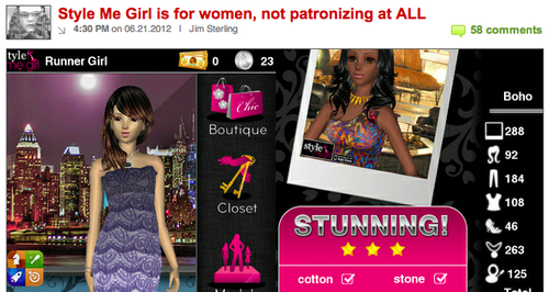
Amid the positive articles on our Style Me Girl launch from , and others, one popped up by from a very different angle:

Jim’s view as I read it was that a fashion RPG designed for girls and women playing as a stylist was patronizing. His final paragraph:
Rejoice, GURL GAMARZ, no longer will you have to play Calling Duty or Grand Auto Grab with those smelly boys. Now there is a game that you little ladies can play while you’re shopping for shoes and thinking about kissing the high school leader of the footbasket team. Aren’t you lucky?
Well before responding, to be clear I have a lot of respect for Jim and his work. He’s among the best in the business and it’s refreshing to see someone call it as they see it. Not to mention it’s way more fun to read, which is why I count myself as one of many Destructoid fans.
That said I have to respectfully disagree and respond:
- The piece mentions that we’re described as the “first mobile RPG exclusively for women.” Rather, what we did say was that it was the first 3D fashion RPG game, because we feel our 3D technology is quite unique, and that it was among the relatively few RPG games for women. And yes, there are boys and guys who play as well which is just fine by us.
- We feel female gamers should be able to enjoy different types of games including ones made specifically for them. Our new designer Moona loves World of Warcraft as well as girl games like Fashion Story. Jasmine, our marketing manager plays Crime City and D3 as well as Top Girl. Shouldn’t there be Vogues and Cosmos to complement GQs and Newsweeks? Imho, the more choice the better. Hence Me Girl.
- Finally playing a game where you are an aspiring stylist, shopping and doing photo shoots is to us, a positive thing. Fashion is fun and creative! Games are fun and creative! Both have no age limits. Why not bring the two together?
And whilst there was plenty of debate in the comments, it’s good to see others in the Destructoid community who feel the same way:

Anyway long live freedom of opinion and choice. Now it’s back to work :)

