How iOS 7 appstore changes affect developers
New iOS, new App Store…
If you’re like me, it’s time for optimism with a touch of dread. Are the changes better or worse for my apps? My players?
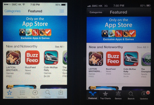
Recently checked out the Appstore in iOS 7 vs iOS 6. Overall it’s a step forward and imho mostly positive for devs. Here are the side-by-side iPhone screenshots. Recommendations at the end.
Featured Page

- More new and noteworthy spots shown before requiring you to tap “see all” (around a third more) means more chances to get your game downloaded if you’re one of the lucky few selected by Apple
- larger icon spacing, in general through the App Store
- Rest is pretty similar
Top Charts

- Ratings now included (total number, not just for current version)
- More downloads for the long term hit games
- Now autoscrolls down to see the list, instead of to the right
- Not requiring you to tap “See All” reduces friction
- More download for those popular games not in the top 25
- Easier to access top grossing = more downloads for the monetizers
- Category button is more prominent, meaning more spread of downloads
- Rest is similar
Category navigation

- Similar
Subcategories - eg Role Playing

- New vertical scrolling layout, same as top charts (above)
Near Me vs Genius

- Genius is dead - less organic installs for game devs (though hard to tell how many it drove in first place - wasn’t a strong UX)
- Favours locally popular apps (events, venues etc) - though for gaming that probably doesn’t matter as much, especially with country specific App Stores
Search

- Search algorithm seems the same so far
- Shows number of results in search bar
- Larger screenshot
- Shows review count (all versions) - favours older games
Screenshots

- Second screenshot matters more than before - more now shown
App Main Page

- Larger game icon (can put text in there)
- Link to the Related tab for more apps from the developer (better for organic intraportfolio growth)
Reviews Page

- Pretty similar, now shows more reviews before hitting the button
Related Page

- Similar with some sizing changes
My take
- Your higher monetization games should get a bit more organics now
- Less pressure to be up in the top 25 - download spread broader
- Trying to do well in a single subcategory is a bit easier now
- No more free lunch - whatever Genius gave has been taken away
- Pay attention to the left of your second screenshot
- Keep trying to get your app featured, more chance of impact now
- Your rating and rating count matters more than ever - focus on quality and genuine ways to get more reviews
ps- big thanks to ‘er Jer for pulling this together!
Your thoughts? Have I missed something? Share on or
